Archive for category fun
Wicked smart playlists
Over the past few weekends I’ve been working on a little side project called the Playlist Builder Library (or PBL for short). The Playlist Builder Library is a Python library for creating and manipulating playlists. It’s sort of like remix for playlists. With PBL you can take songs from playlists, albums, artists, genres and flexibly combined them, rearrange them, filter them and sort them into new playlists.
For example, here’s a PBL program that creates radio station of today’s top hits but guarantees that every 4th song is either by Sia or Katy Perry:
[gist https://gist.github.com/plamere/2fa839150815f040450d]Here’s the resulting playlist:
[spotify spotify:user:plamere:playlist:6TIeQMve7pVBLCAY8WUX3L]That’s 5 lines a code to create a non-trivial playlist.
PBL supports all sorts of sources for tracks such as Spotify playlists, top tracks from artists, albums, genres, the extremely flexible and powerful Echo Nest playlisting API. These sources can be manipulated in all sorts of interesting ways. Here are a couple more examples:
You can filter all the songs in ‘Your favorite coffeehouse’ to get just the lowest energy songs:
coffee = PlaylistSource('coffeehouse', ucoffee_house)
low_energy_coffee = AttributeRangeFilter(coffee, 'echonest.energy', max_val=.5)
You an combine your favorite playlists in a single one:
playlist_names = ['Your Favorite Coffeehouse', 'Acoustic Summer','Acoustic Covers', 'Rainy Day']
all = DeDup(Alternate([Sample(PlaylistSource(n), 10) for n in playlist_names]))
Even sophisticated tasks are really easy. For instance, imagine dad is on a roadtrip with daughter. They agree to alternate between dad’s music and daughter’s music. Dad is selfish, so he makes a playlist that alternates the longest cool jazz tracks with the shortest teen party playlists with this 3 line script:
teen_party = First(Sorter(PlaylistSource('Teen Party'), 'duration'), 10)

jazz_classics = Last(Sorter(PlaylistSource('Jazz Classics'), 'duration'), 10)

both = Alternate([teen_party, Reverse(jazz_classics)])
Here’s the result
[spotify spotify:user:plamere:playlist:0VKGTR6eCPe55bBjezi5z3]Note that the average duration of Teen Party songs is much less than 3 minutes, while the average duration of Jazz Classics is above 6 minutes. Selfish dad gets to listen to his music twice as long with this jazz-skewing playlist.
There’s a whole lot of nifty things that can be done with PBL. If you are a Python programmer with an itch for creating new playlists check it out. The docs are online at http://pbl.readthedocs.org/ and the source is at https://github.com/plamere/pbl.
PBL is pretty modular so it is easy to add new sources and manipulators, so if you have an idea or two for changes let me know or just send me a pull request.
The Drop Machine
I spent last weekend in Cannes, participating in the MIDEM Hack Day – an event where music hackers from around the globe gather to hack on music. My hack is called The Drop Machine. It is a toy web app that plays nothing but the drops. Here’s a video demo of it:
[youtube http://youtu.be/4C6a-MqAF_A]The interesting bit in this hack is how The Drop Machine finds the drops. I’ve tried a number of different ways to find the drops in the past – for instance, the app Where’s the Drama found the most dramatic bits of music based on changes in music dynamics. This did a pretty good job of finding the epic builds in certain kinds of music, but it wasn’t a very reliable drop detector. The Drop Machine takes a very different approach – it crowd sources the finding of the drop. And it turns out, the crowd knows exactly where the drop is. So how do we crowd source finding the drop? Well, every time you scrub your music player to play a particular bit of music on Spotify, that scrubbing is anonymously logged. If you scrub to the chorus or the guitar solo or the epic drop, it is noted in the logs. When one person scrubs to a particular point in a song, we learn a tiny bit about how that person feels about that part of the song – perhaps they like it more than the part that they are skipping over – or perhaps they are trying to learn the lyrics or the guitar fingering for that part of the song. Who’s to say? On an individual level, this data wouldn’t mean much. The cool part comes from the anonymous aggregate behavior of millions of listeners, from which a really detailed map of the song emerges. People scrub to just before the best parts of the song to listen to them. Let’s take a look at a few examples.
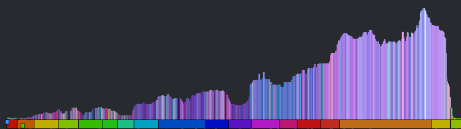
For starters here’s a plot that shows the most listened to part of the song In the Air Tonight by Phil Collins based upon scrubbing behavior:
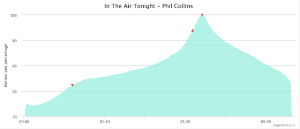
The prominent peak at 3:40 is the point when the drums come in. Based upon scrubbing behavior alone, we are able to find arguably the most interesting bit of that song.
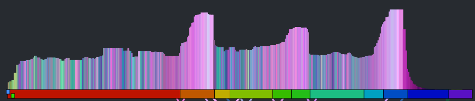
Here’s another example – Whole Lotta Love by Led Zeppelin:
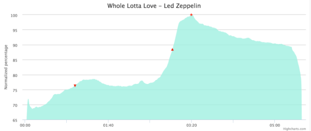
The trough at 1:40 corresponds to the psychedelic bits while the peak at 3:20 is the guitar solo. Again, by looking at scrubbing behavior we get a really good indication of what parts of a song listeners enjoy the most.
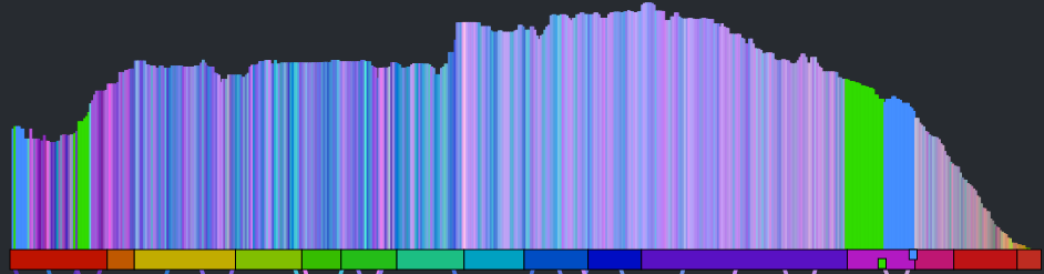
When we look at scrubbing behavior for dance music, especially dubstep and brostep, we see a very characteristic strong peak, usually at around a minute into the song. This is invariably ‘the drop’. Here are some examples:

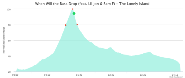
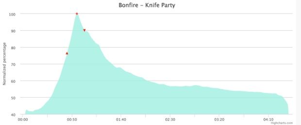
The scrubbing behavior not only shows us where the drop is, but it also shows us how intense the drop is – drops with lots of appeal get lots of attention (and lots of scrubs) while songs with milder drops get less attention. Here’s a milder drop by Skrillex:
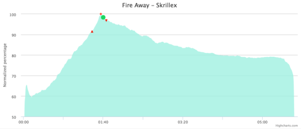
Compare that to the much more intense drop:
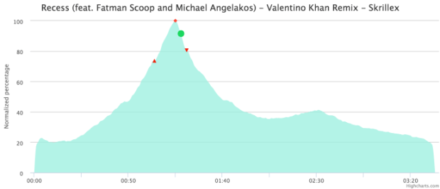
Songs with more intense drops have more prominent scrubbing and listening peaks at the drop than others. The Drop Machine uses the prominence of the peak at the drop to find the songs with the most intense drops.
Putting it all together, the Drop Machine searches through the most popular dance, dubstep and brostep tracks and finds the ones with the most prominent listening peaks based upon scrubbing behavior. It then surfaces these tracks into a playlist, and then plays 10 seconds of each track centered around the drop. The result is non-stop drop. Add in a bit of animation synchronized to the music and that’s the Drop Machine.
Currently, the Drop Machine is an internal-use only hack, I’m working on making a public version, so hopefully the world won’t have to wait too long before you all can listen to the Drop Machine.
The Million Songs of Christmas
No other holiday dominates our listening like Christmas. During this season, we are exposed to a seemingly never ending playlist of Christmas music. So its no surprise that there’s a huge amount of Christmas music available on Spotify. How much? Let’s take a look.
How much Christmas music is there?
It is actually quite hard to pinpoint the exact number of Christmas songs. First, every week during the holiday season thousands more Christmas songs are added to the set. Second, some songs are seasonal – is Frosty The Snowman a Christmas song? Not literally, but it gets a lot of play at this time of year, even by the antipodes. Finally, there are a number of other holidays and celebrations at this time of year such as Hanukkah, Boxing Day, New Years, Kwanzaa, the Winter Solstice, and Festivus that we want to include in this category. So when I say “Christmas Music” I’m referring to western music that is played primarily during December. There’s probably a better term to describe this music, but terms like seasonal, and holiday have their own special baggage – perhaps something like music coincident with the northern hemispheric winter solstice is the most precise description, but lets stick with Christmas music just to keep things simple. So how much Christmas music is there? In early December 2014, crack music + data nerd Aaron Daubman dove into the Spotify + Echo Nest music catalog and found 914,047 Christmas tracks – that’s just under a million Christmas tracks. Let’s unwrap this dataset to see what we can find.
First, some basic stats: Those 914,047 tracks represent 180,660 unique songs and were created by 63,711 unique artists – from Aaron Neville to Zuma the King. The top 20 artists with the most Christmas tracks in the Spotify catalog are all pre-Beatles artists:
Artists with the most Christmas Tracks
| # | Name | Count |
|---|---|---|
| 1 | Bing Crosby | 22382 |
| 2 | Frank Sinatra | 17979 |
| 3 | Elvis Presley | 12381 |
| 4 | Nat King Cole | 11613 |
| 5 | Johann Sebastian Bach | 8958 |
| 6 | Dean Martin | 8000 |
| 7 | Perry Como | 7529 |
| 8 | Ella Fitzgerald | 6428 |
| 9 | Mahalia Jackson | 5883 |
| 10 | Mario Lanza | 5377 |
| 11 | Johnny Mathis | 5036 |
| 12 | Rosemary Clooney | 4538 |
| 13 | Peggy Lee | 4450 |
| 14 | Harry Belafonte | 4054 |
| 15 | The Andrews Sisters | 3567 |
| 16 | Louis Armstrong | 3481 |
| 17 | Gene Autry | 3411 |
| 18 | Doris Day | 2985 |
| 19 | Pat Boone | 2767 |
| 20 | Connie Francis | 2500 |
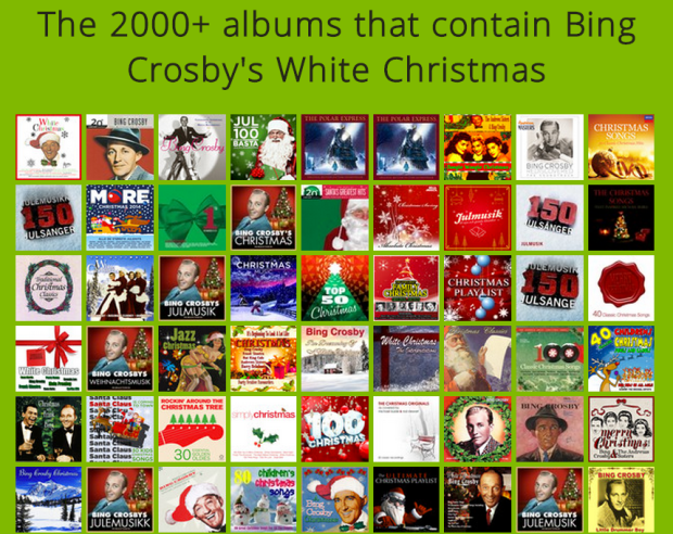
Yes, that’s right, Bing Crosby has 22,382 different Christmas tracks (!) in the Spotify catalog. Now, a little digression on what we consider to be a unique track. Music, especially popular music, is released in many forms. A very popular song, such as Bing Crosby’s White Christmas, may appear on a wide range of albums – from the original studio release to a plethora of Christmas Compilations and artist ‘best of’ albums. Each of these track releases may have different album art, different rights holders and regional licenses. Thus, even though the audio for White Christmas may be the same on each of the release, we consider each release as a different track.
White Christmas
Let’s take a closer look at Bing Crosby’s White Christmas. In our catalog of nearly a million Christmas tracks, 2,196 of them are Bing Crosby’s classic. I’ll say that again, just because it is a rather phenomenal fact – there are 2,196 different albums on Spotify that contain Bing’s White Christmas. It is hard to believe, so I created a web page that contains all 2,196 of the albums so you can see them all. Click on the image below to load them all up (warning – with 2000+ album covers it’s a bit of a browser buster).
White Christmas isn’t the only uber-track of the holidays. Here are the top 25 Christmas tracks based upon the number of times they have been released on an album:
The most released Christmas tracks
| # | Name | Count |
| 1 | Bing Crosby – White Christmas | 2196 |
| 2 | Eartha Kitt – Santa Baby | 1286 |
| 3 | Elvis Presley – Blue Christmas | 1285 |
| 4 | Frank Sinatra – Jingle Bells | 1121 |
| 5 | Harry Belafonte – Mary’s Boy Child | 904 |
| 6 | Bing Crosby – Silver Bells | 881 |
| 7 | Nat King Cole – The Christmas Song | 870 |
| 8 | Frank Sinatra – The Christmas Waltz | 811 |
| 9 | Rosemary Clooney – Suzy Snowflake | 788 |
| 10 | Bobby Helms – Jingle Bell Rock | 779 |
| 11 | Elvis Presley – White Christmas | 738 |
| 12 | Judy Garland – Have Yourself a Merry Little Christmas | 735 |
| 13 | Frank Sinatra – White Christmas | 703 |
| 14 | Frank Sinatra – Christmas Dreaming | 696 |
| 15 | Frank Sinatra – Have Yourself a Merry Little Christmas | 695 |
| 16 | Elvis Presley – Silent Night | 688 |
| 17 | Elvis Presley – I Believe | 664 |
| 18 | Frank Sinatra – Santa Claus Is Coming to Town | 660 |
| 19 | Louis Armstrong – Zat You Santa Claus | 598 |
| 20 | Dean Martin – The Christmas Blues | 575 |
| 21 | Frank Sinatra – Mistletoe and Holly | 568 |
| 22 | Louis Armstrong – Cool Yule | 566 |
| 23 | Frank Sinatra – Silent Night | 563 |
| 24 | Bing Crosby – Jingle Bells | 560 |
| 25 | Elvis Presley – Santa Claus Is Back in Town | 559 |
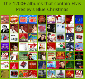
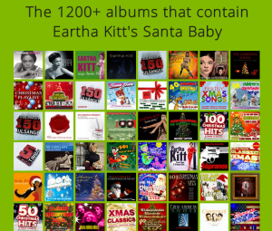
You can see all of the releases for Elvis’s Blue Christmas and Eartha Kitt’s Santa Baby here:
So there are lots of copies of Bing Crosby’s White Christmas and Eartha Kitt’s Santa Baby out there – but what are the most common Christmas songs overall? Which ones have been recorded the most by any artist? The following table shows the top 25:
Most recorded songs
| # | Name | Recordings |
| 1 | Silent Night | 19041 |
| 2 | White Christmas | 15928 |
| 3 | Jingle Bells | 14521 |
| 4 | Winter Wonderland | 9524 |
| 5 | Joy to the World | 9093 |
| 6 | The First Noel | 8731 |
| 7 | Have Yourself a Merry Little Christmas | 8511 |
| 8 | O Holy Night | 7925 |
| 9 | Hark The Herald Angels Sing | 7727 |
| 10 | The Christmas Song | 7673 |
| 11 | Away in a Manger | 7544 |
| 12 | God Rest Ye Merry Gentlemen | 7524 |
| 13 | O Little Town of Bethlehem | 7480 |
| 14 | Santa Claus Is Coming To Town | 6851 |
| 15 | I’ll Be Home for Christmas | 6844 |
| 16 | O Come All Ye Faithful | 6273 |
| 17 | Deck The Halls | 6057 |
| 18 | Silver Bells | 6044 |
| 19 | Ave Maria | 5847 |
| 20 | What Child Is This? | 5755 |
| 21 | We Wish You A Merry Christmas | 5619 |
| 22 | It Came Upon A Midnight Clear | 5019 |
| 23 | Sleigh Ride | 5004 |
| 24 | Blue Christmas | 4688 |
| 25 | Let It Snow! Let It Snow! Let It Snow! | 4598 |
Of course this data may be confounded by the uber-tracks like White Christmas that have thousands of versions by a single artist, so lets look at the most recorded songs by unique artists – that is, we only count Bing Crosby once for White Christmas instead of 2,196 times. When we do that the top 25 changes a bit:
Most recorded Christmas songs (Unique Artists)
| # | Name | Recordings |
| 1 | Silent Night | 7406 |
| 2 | Jingle Bells | 4485 |
| 3 | Joy to the World | 3593 |
| 4 | White Christmas | 3592 |
| 5 | O Holy Night | 3536 |
| 6 | The First Noel | 3181 |
| 7 | What Child Is This? | 3150 |
| 8 | Away in a Manger | 3140 |
| 9 | God Rest Ye Merry Gentlemen | 2871 |
| 10 | Have Yourself a Merry Little Christmas | 2823 |
| 11 | O Come All Ye Faithful | 2675 |
| 12 | Hark The Herald Angels Sing | 2638 |
| 13 | Angels We Have Heard on High | 2494 |
| 14 | Winter Wonderland | 2489 |
| 15 | The Christmas Song | 2398 |
| 16 | We Wish You A Merry Christmas | 2281 |
| 17 | Deck The Halls | 2274 |
| 18 | O Little Town of Bethlehem | 2197 |
| 19 | We Three Kings | 2048 |
| 20 | Santa Claus Is Coming To Town | 1837 |
| 21 | It Came Upon A Midnight Clear | 1768 |
| 22 | Ave Maria | 1705 |
| 23 | Auld Lang Syne | 1603 |
| 24 | Silver Bells | 1599 |
| 25 | I’ll Be Home for Christmas | 1577 |
The songs in green are the songs that are unique to each list.
Artists with the most number of unique songs
Bing Crosby is at the top of the Most Christmasy artists mainly because of the widespread re-issuing of White Christmas. But if we look at unique songs (i.e. White Christmas only counts once for Bing Crosby), the top Christmas artists look very different – with classical composers, Karaoke ‘artists’ and music factories topping the charts:
Artists with the most number of unique songs
| 1 | Johann Sebastian Bach | 3681 |
| 2 | Bing Crosby | 1462 |
| 3 | The Karaoke Channel | 1098 |
| 4 | George Frideric Handel | 903 |
| 5 | A-Type Player | 835 |
| 6 | Frank Sinatra | 816 |
| 7 | ProSound Karaoke Band | 762 |
| 8 | Pyotr Ilyich Tchaikovsky | 691 |
| 9 | SBI Audio Karaoke | 641 |
| 10 | Mega Tracks Karaoke Band | 577 |
| 11 | ProSource Karaoke | 539 |
| 12 | Ameritz Karaoke Entertainment | 508 |
| 13 | Tbilisi Symphony Orchestra | 506 |
| 14 | Elvis Presley | 472 |
| 15 | Perry Como | 440 |
| 16 | Karaoke – Ameritz | 428 |
| 17 | Nat King Cole | 413 |
| 18 | Ameritz Karaoke Band | 397 |
| 19 | Merry Tune Makers | 385 |
| 20 | Christmas Songs | 370 |
Current popular Christmas crooner Michael Bublé, with 31 unique Christmas songs has a way to go before he makes it on to the most-unique-songs-recorded chart.
Speaking of Karaoke – there’s lots of Christmas Karaoke – 23,472 tracks to be precise. The top 25 Karaoke songs are the classics:
Top Karaoke Christmas Songs
| # | Name | Count |
| 1 | White Christmas | 345 |
| 2 | Winter Wonderland | 333 |
| 3 | Silent Night | 312 |
| 4 | Jingle Bells | 309 |
| 5 | Last Christmas | 258 |
| 6 | Silver Bells | 219 |
| 7 | Blue Christmas | 204 |
| 8 | Santa Baby | 189 |
| 9 | The Christmas Song | 185 |
| 10 | Jingle Bell Rock | 172 |
| 11 | Have Yourself a Merry Little Christmas | 171 |
| 12 | Please Come Home for Christmas | 163 |
| 13 | Little Drummer Boy | 163 |
| 14 | Sleigh Ride | 156 |
| 15 | O Come All Ye Faithful | 154 |
| 16 | Here Comes Santa Claus | 150 |
| 17 | Feliz Navidad | 146 |
| 18 | All I Want for Christmas Is You | 146 |
| 19 | O Holy Night | 144 |
| 20 | I Saw Mommy Kissing Santa Claus | 143 |
| 21 | Rockin’ Around the Christmas Tree | 135 |
| 22 | Santa Claus Is Coming to Town | 126 |
| 23 | Frosty the Snowman | 125 |
| 24 | Rudolph the Red Nosed Reindeer | 121 |
| 25 | We Wish You a Merry Christmas | 118 |
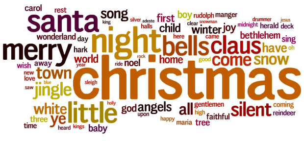
Top Terms
We can build a good list of seasonal terms by finding the most frequently occurring words in song titles. Here are the top 75 or so, as a word cloud created by wordle (stop words are removed of course).
Longest Christmas song name
There are lots of very long song names in the set of Christmas songs – the longest is this Christmas medly.
A great song for testing how well your music player UI deals with unusual titles.
Conclusion
One would think that with a million Christmas tracks we’d already have more than enough Christmas music – but, it seems, we still like new Christmas music. Ariana Grande’s recently released Santa Tell Me is climbing the streaming charts (currently #44 at charts.spotify.com).
Plus, there’s seemingly no-end to the variety of Christmas Music. If White Christmas with Bing Crosby is not your style, then there’s Blue Christmas by Elvis.
And If that’s not your thing, maybe you’ll enjoy Red Christmas by Insane Clown Posse.
‘Tis the Season
‘Tis the season for artists to release Christmas music … and they release lots of it. In the last two weeks Spotify has added thousands of releases with ‘Christmas’ in the title. I though it would be fun to build a little web app that lets you explore through all the releases. Here it is: ‘Tis the Season.
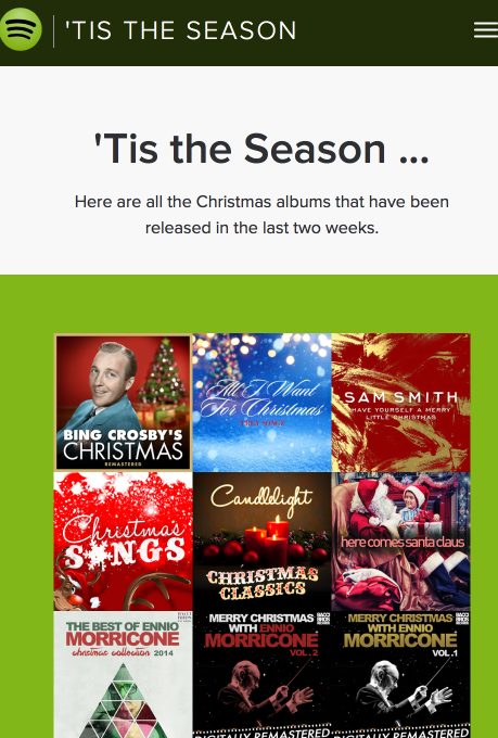
It shows you all the Christmas albums that have been released in the last few weeks, lets you listen to them and lets you open them in Spotify.
It makes use of the Spotify Web API – there’s a nifty search feature that lets you restrict album searches to albums that have just been recently release. That’s what makes this app possible. Check out the app at ‘Tis the Season. The source is on github.
Tracking play coverage in the Infinite Jukebox
Yesterday, I upgraded the Infinite Jukebox to make it less likely that it would get stuck in a section of the song. As part of this work, I needed an easy way to see the play coverage in the song. To do so, I updated the Infinite Jukebox visualization so that it directly shows play coverage. With this update, the height of any beat in the visualization is proportional to how often that beat has been played relative to the other beats in the song. Beats that have been played more have taller bars in the visualization.
This makes it easy to see if we’ve improved play coverage. For example, here’s the visualization of Radiohead’s Karma Police with the old play algorithm after about an hour of play:
As you can see, there’s quite a bit of bunching up of plays in the third quarter of the song (from about 7 o’clock to 10 o’clock). Now compare that to the visualization of the new algorithm:
With the new algorithm, there’s much less bunching of play. Play is much more evenly distributed across the whole song.
Here’s another example. The song First of the Year (Equinox) by Skrillex played for about seven hours with the old algorithm:
As you can see, it has quite uneven coverage. Note the intro and outro of the song are almost always the least played of any song, since those parts of the song typically have very little similarity with the rest of the song.
Here’s the same song with the new algorithm:
Again, play coverage is much more even across all of the song outside of the intro and the outro.
I like this play coverage visualization so much that I’ve now made it part of the standard Infinite Jukebox. Now as you play a song in the Jukebox, you’ll get to see the song coverage map as well. Give it a try and let me know what you think.
The Ultimate Thanksgiving Playlist
On the annual drive to Thanksgiving dinner I’ve tortured my family with Alice’s Restaurant too many times over the years. Arlo Guthrie’s classic is still, in my mind, the classic Thanksgiving song, but there has to be more. So this year, I set out to expand my repertoire of Thanksgiving music – to build the ultimate Thanksgiving playlist. To do so, I looked through the top 300 or so most listened to Thanksgiving playlists on Spotify and found the top 100 songs that most frequently appear in all of these playlists, after discounting for popularity. Here are the results: The Ultimate Thanksgiving Playlist:
[spotify spotify:user:plamere:playlist:7EOwcqcYhCDsrvoutSVP9E]This is six hours of Thanksgiving music. All the classics are there, from Alice’s Restaurant to We are going to be Friends by the White Stripes. It should get you through the Thanksgiving drive, the meal, dessert and maybe even an after dinner snack.
However, if you want to synchronize your cooking and your music listening, there’s no better way then to hop on over to Time For Turkey for your basting+music needs.
And since the Christmas season starts immediately after the last piece of pumpkin pie has been consumed, lets not waste time breaking out the Christmas playlist. Here are the top 100 songs appearing across the most popular 1,000 Christmas playlists: Top Christmas Songs
[spotify spotify:user:plamere:playlist:26fUkb0ZQdg62IY497OdNL]Acrostify – make Spotify playlists with embedded secret messages
Posted by Paul in code, fun, Spotify, The Echo Nest on August 8, 2014
For my summer vacation early-morning coding for fun project I revamped my old Acrostic Playlist Maker to work with Spotify. The app, called Acrostify, will generate acrostic playlists with the first letter of each song in the playlist spelling out a secret message. With the app, you can create acrostic playlists and save them to Spotify.
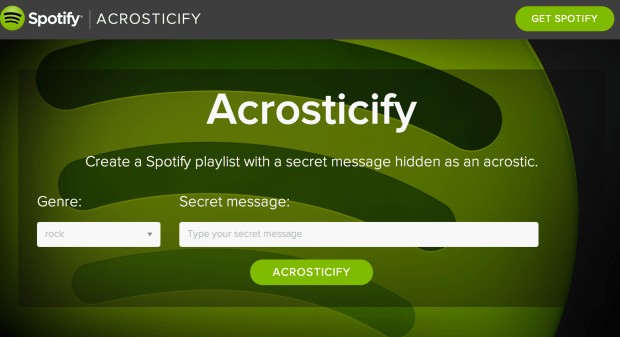
The app was built using The Echo Nest and Spotify APIs. The source is on github.
Give it a try at Acrostify.
My new superpower – creating Spotify playlists from a web app
 The new Spotify Web API allows the developer to create and add tracks to a playlist on behalf of a listener. This is a pretty powerful feature, opening the door for a whole range of apps. For instance, this weekend, I added the ability to save a Roadtrip Mixtape playlist, so you can now actually take your mixtapes on the road. The code is on github if you are interested in seeing how it is done.
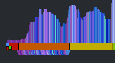
How the Autocanonizer works
Posted by Paul in code, data, events, fun, genre, hacking, music hack day, The Echo Nest on March 18, 2014
Last week at the SXSW Music Hack Championship hackathon I built The Autocanonizer. An app that tries to turn any song into a canon by playing it against a copy of itself. In this post, I explain how it works.
At the core of The Autocanonizer are three functions – (1) Build simultaneous audio streams for the two voices of the canon (2) Play them back simultaneously, (3) Supply a visualization that gives the listener an idea of what is happening under the hood. Let’s look at each of these 3 functions:
(1A) Build simultaneous audio streams – finding similar sounding beats
The goal of the Autocanonizer is to fold a song in on itself in such a way that the result still sounds musical. To do this, we use The Echo Nest analyzer and the jremix library to do much of the heavy lifting. First we use the analyzer to break the song down into beats. Each beat is associated with a timestamp, a duration, a confidence and a set of overlapping audio segments. An audio segment contains a detailed description of a single audio event in the song. It includes harmonic data (i.e. the pitch content), timbral data (the texture of the sound) and a loudness profile. Using this info we can create a Beat Distance Function (BDF) that will return a value that represents the relative distance between any two beats in the audio space. Beats that are close together in this space sound very similar, beats that are far apart sound very different. The BDF works by calculating the average distance between overlapping segments of the two beats where the distance between any two segments is a weighted combination of the euclidean distance between the pitch, timbral, loudness, duration and confidence vectors. The weights control which part of the sound takes more precedence in determining beat distance. For instance we can give more weight to the harmonic content of a beat, or the timbral quality of the beat. There’s no hard science for selecting the weights, I just picked some weights to start with and tweaked them a few times based on how well it worked. I started with the same weights that I used when creating the Infinite Jukebox (which also relies on beat similarity), but ultimately gave more weight to the harmonic component since good harmony is so important to The Autocanonizer.
(1B) Build simultaneous audio streams – building the canon
The next challenge, and perhaps biggest challenge of the whole app, is to build the canon – that is – given the Beat Distance Function, create two audio streams, one beat at a time, that sound good when played simultaneously. The first stream is easy, we’ll just play the beats in normal beat order. It’s the second stream, the canon stream that we have to worry about. The challenge: put the beats in the canon stream in an order such that (1) the beats are in a different order than the main stream, and (2) they sound good when played with the main stream.
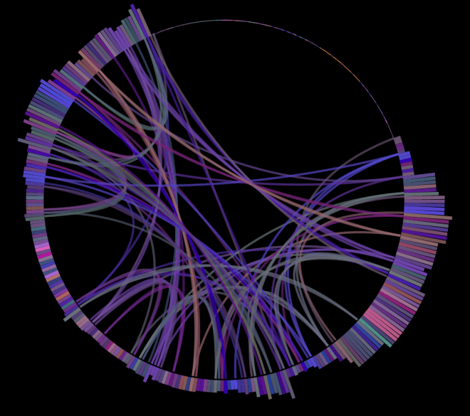
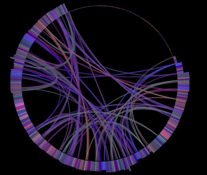
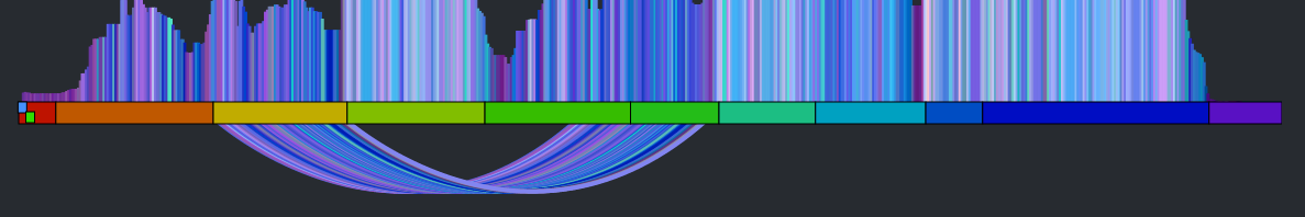
The first thing we can try is to make each beat in the canon stream be the most similar sounding beat to the corresponding beat in the main stream. If we do that we end up with something that looks like this:
It’s a rat’s nest of connections, very little structure is evident. You can listen to what it sounds like by clicking here: Experimental Rat’s Nest version of Someone Like You (autocanonized). It’s worth a listen to get a sense of where we start from. So why does this bounce all over the place like this? There are lots of reasons: First, there’s lots of repetition in music – so if I’m in the first chorus, the most similar beat may be in the second or third chorus – both may sound very similar and it is practically a roll of the dice which one will win leading to much bouncing between the two choruses. Second – since we have to find a similar beat for every beat, even beats that have no near neighbors have to be forced into the graph which turns it into spaghetti. Finally, the underlying beat distance function relies on weights that are hard to generalize for all songs leading to more noise. The bottom line is that this simple approach leads to a chaotic and mostly non-musical canon with head-jarring transitions on the canon channel. We need to do better.
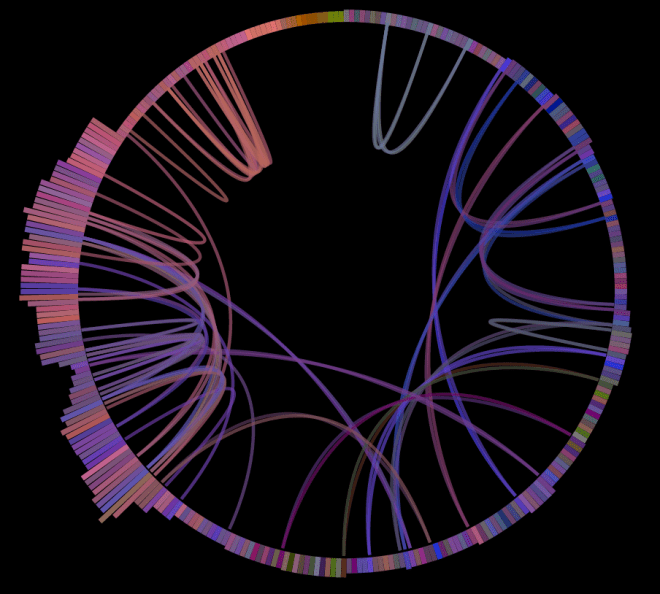
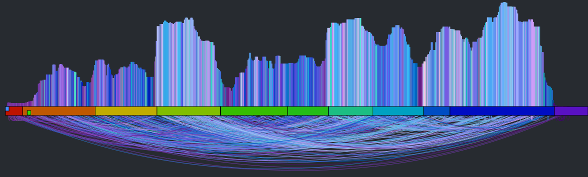
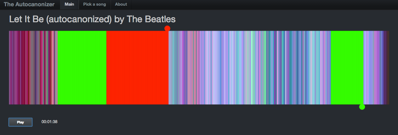
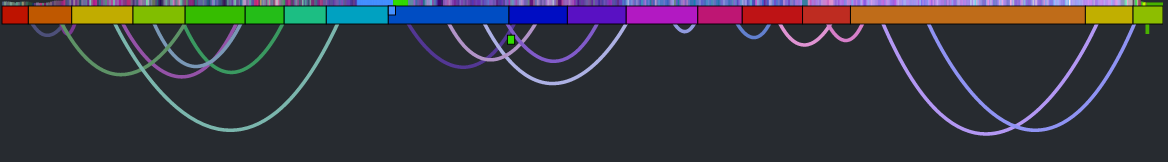
There are glimmers of musicality in this version though. Every once in a while, the canon channel will remaining on a single sequential set of beats for a little while. When this happens, it sounds much more musical. If we can make this happen more often, then we may end up with a better sounding canon. The challenge then is to find a way to identify long consecutive strands of beats that fit well with the main stream. One approach is to break down the main stream into a set of musically coherent phrases and align each of those phrases with a similar sounding coherent phrase. This will help us avoid the many head-jarring transitions that occur in the previous rat’s nest example. But how do we break a song down into coherent phrases? Luckily, it is already done for us. The Echo Nest analysis includes a breakdown of a song into sections – high level musically coherent phrases in the song – exactly what we are looking for. We can use the sections to drive the mapping. Note that breaking a song down into sections is still an open research problem – there’s no perfect algorithm for it yet, but The Echo Nest algorithm is a state-of-the-art algorithm that is probably as good as it gets. Luckily, for this task, we don’t need a perfect algorithm. In the above visualization you can see the sections. Here’s a blown up version – each of the horizontal colored rectangles represents one section:
![]()
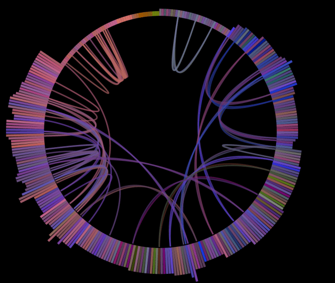
You can see that this song has 11 sections. Our goal then is to get a sequence of beats for the canon stream that aligns well with the beats of each section. To make things at little easier to see, lets focus in on a single section. The following visualization shows the similar beat graph for a single section (section 3) in the song:
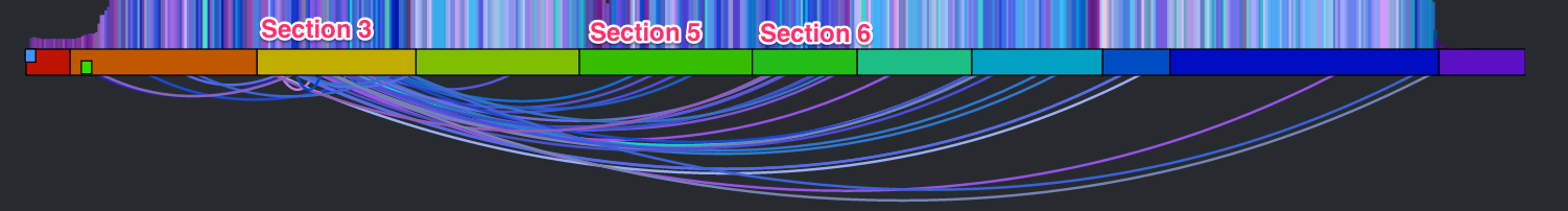
You can see bundles of edges leaving section 3 bound for section 5 and 6. We could use these bundles to find most similar sections and simply overlap these sections. However, given that sections are rarely the same length nor are they likely to be aligned to similar sounding musical events, it is unlikely that this would give a good listening experience. However, we can still use this bundling to our advantage. Remember, our goal is to find a good coherent sequence of beats for the canon stream. We can make a simplifying rule that we will select a single sequence of beats for the canon stream to align with each section. The challenge, then, is to simply pick the best sequence for each section. We can use these edge bundles to help us do this. For each beat in the main stream section we calculate the distance to its most similar sounding beat. We aggregate these counts and find the most commonly occurring distance. For example, there are 64 beats in Section 3. The most common occurring jump distance to a sibling beat is 184 beats away. There are ten beats in the section with a similar beat at this distance. We then use this most common distance of 184 to generate the canon stream for the entire section. For each beat of this section in the main stream, we add a beat in the canon stream that is 184 beats away from the main stream beat. Thus for each main stream section we find the most similar matching stream of beats for the canon stream. This visualizing shows the corresponding canon beat for each beat in the main stream.
This has a number of good properties. First, the segments don’t need to be perfectly aligned with each other. Note, in the above visualization that the similar beats to section 3 span across section 5 and 6. If there are two separate chorus segments that should overlap, it is no problem if they don’t start at the exactly the same point in the chorus. The inter-beat distance will sort it all out. Second, we get good behavior even for sections that have no strong complimentary section. For instance, the second section is mostly self-similar, so this approach aligns the section with a copy of itself offset by a few beats leading to a very nice call and answer.
That’s the core mechanism of the autocanonizer – for each section in the song, find the most commonly occurring distance to a sibling beat, and then generate the canon stream by assembling beats using that most commonly occurring distance. The algorithm is not perfect. It fails badly on some songs, but for many songs it generates a really good cannon affect. The gallery has 20 or so of my favorites.
(2) Play the streams back simultaneously
When I first released my hack, to actually render the two streams as audio, I played each beat of the two streams simultaneously using the web audio API. This was the easiest thing to do, but for many songs this results in some very noticeable audio artifacts at the beat boundaries. Any time there’s an interruption in the audio stream there’s likely to be a click or a pop. For this to be a viable hack that I want to show people I really needed to get rid of those artifacts. To do this I take advantage of the fact that for the most part we are playing longer sequences of continuous beats. So instead of playing a single beat at a time, I queue up the remaining beats in the song, as a single queued buffer. When it is time to play the next beat, I check to see if is the same that would naturally play if I let the currently playing queue continue. If it is I ‘let it ride’ so to speak. The next beat plays seamlessly without any audio artifacts. I can do this for both the main stream and the canon stream. This virtually elimianates all the pops and clicks. However, there’s a complicating factor. A song can vary in tempo throughout, so the canon stream and the main stream can easily get out of sync. To remedy this, at every beat we calculate the accumulated timing error between the two streams. If this error exceeds a certain threshold (currently 50ms), the canon stream is resync’d starting from the current beat. Thus, we can keep both streams in sync with each other while minimizing the need to explicitly queue beats that results in the audio artifacts. The result is an audio stream that is nearly click free.
(3) Supply a visualization that gives the listener an idea of how the app works
I’ve found with many of these remixing apps, giving the listener a visualization that helps them understand what is happening under the hood is a key part of the hack. The first visualization that accompanied my hack was rather lame:
It showed the beats lined up in a row, colored by the timbral data. The two playback streams were represented by two ‘tape heads’ – the red tape head playing the main stream and the green head showing the canon stream. You could click on beats to play different parts of the song, but it didn’t really give you an idea what was going on under the hood. In the few days since the hackathon, I’ve spent a few hours upgrading the visualization to be something better. I did four things: Reveal more about the song structure, show the song sections, show, the canon graph and animate the transitions.
Reveal more about the song
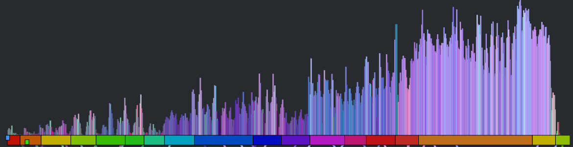
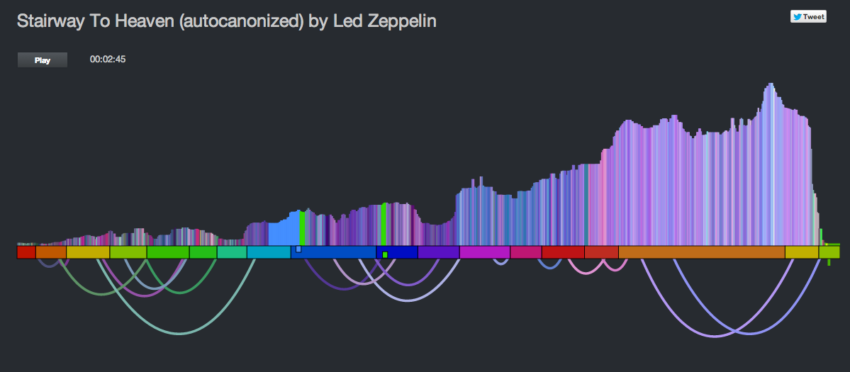
The colored bars don’t really tell you too much about the song. With a good song visualization you should be able to tell the difference between two songs that you know just by looking at the visualization. In addition to the timbral coloring, showing the loudness at each beat should reveal some of the song structure. Here’s a plot that shows the beat-by-beat loudness for the song stairway to heaven.
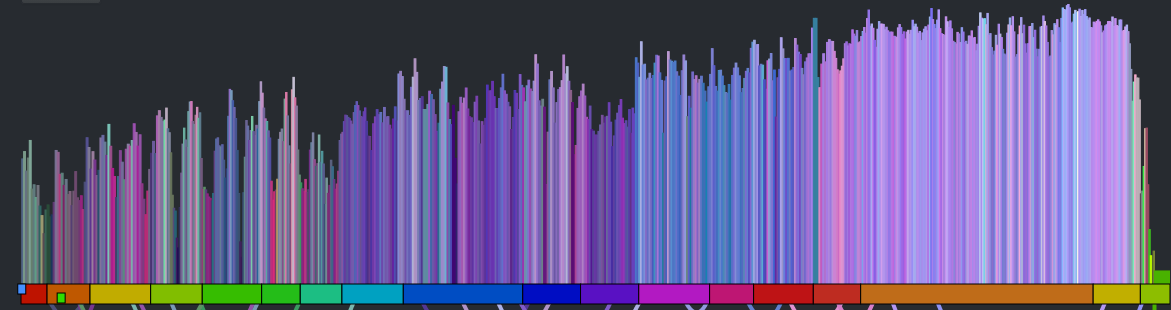
You can see the steady build in volume over the course of the song. But it is still less than an ideal plot. First of all, one would expect the build for a song like Stairway to Heaven to be more dramatic than this slight incline shows. This is because the loudness scale is a logarithmic scale. We can get back some of the dynamic range by converting to a linear scale like so:
This is much better, but the noise still dominates the plot. We can smooth out the noise by taking a windowed average of the loudness for each beat. Unfortunately, that also softens the sharp edges so that short events, like ‘the drop’ could get lost. We want to be able to preserve the edges for significant edges while still eliminating much of the noise. A good way to do this is to use a median filter instead of a mean filter. When we apply such a filter we get a plot that looks like this:
The noise is gone, but we still have all the nice sharp edges. Now there’s enough info to help us distinguish between two well known songs. See if you can tell which of the following songs is ‘A day in the life’ by The Beatles and which one is ‘Hey Jude’ by The Beatles.
Which song is it? Hey Jude or A day in the Life?
Which song is it? Hey Jude or A day in the Life?
Show the song sections
As part of the visualization upgrades I wanted to show the song sections to help show where the canon phrase boundaries are. To do this I created a the simple set of colored blocks along the baseline. Each one aligns with a section. The colors are assigned randomly.
Show the canon graph and animate the transitions.
To help the listener understand how the canon is structured, I show the canon transitions as arcs along the bottom of the graph. When the song is playing, the green cursor, representing the canon stream animates along the graph giving the listener a dynamic view of what is going on. The animations were fun to do. They weren’t built into Raphael, instead I got to do them manually. I’m pretty pleased with how they came out.
All in all I think the visualization is pretty neat now compared to where it was after the hack. It is colorful and eye catching. It tells you quite a bit about the structure and make up of a song (including detailed loudness, timbral and section info). It shows how the song will be represented as a canon, and when the song is playing it animates to show you exactly what parts of the song are being played against each other. You can interact with the vizualization by clicking on it to listen to any particular part of the canon.
Wrapping up – this was a fun hack and the results are pretty unique. I don’t know of any other auto-canonizing apps out there. It was pretty fun to demo that hack at the SXSW Music Hack Championships too. People really seemed to like it and even applauded spontaneously in the middle of my demo. The updates I’ve made since then – such as fixing the audio glitches and giving the visualization a face lift make it ready for the world to come and visit. Now I just need to wait for them to come.
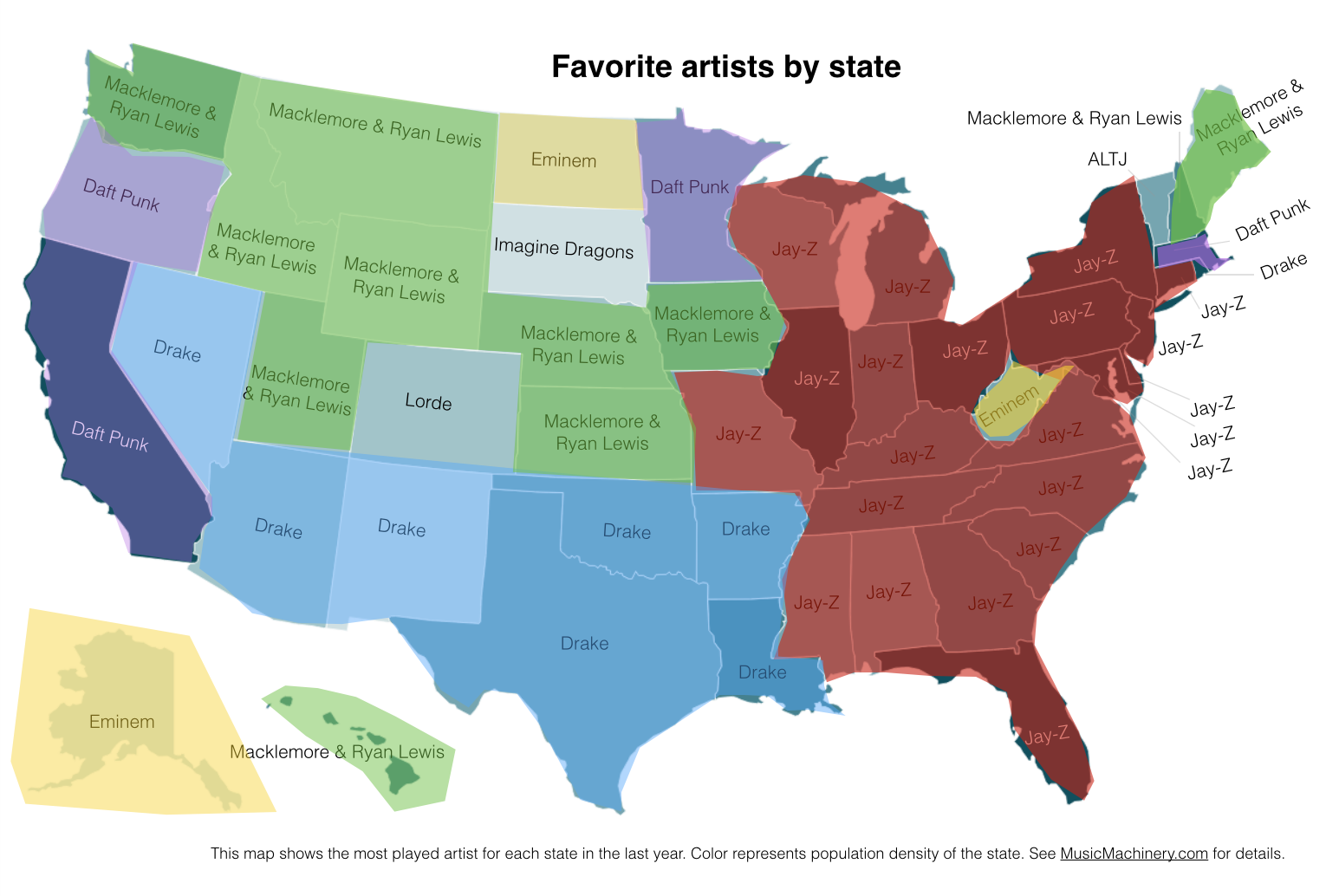
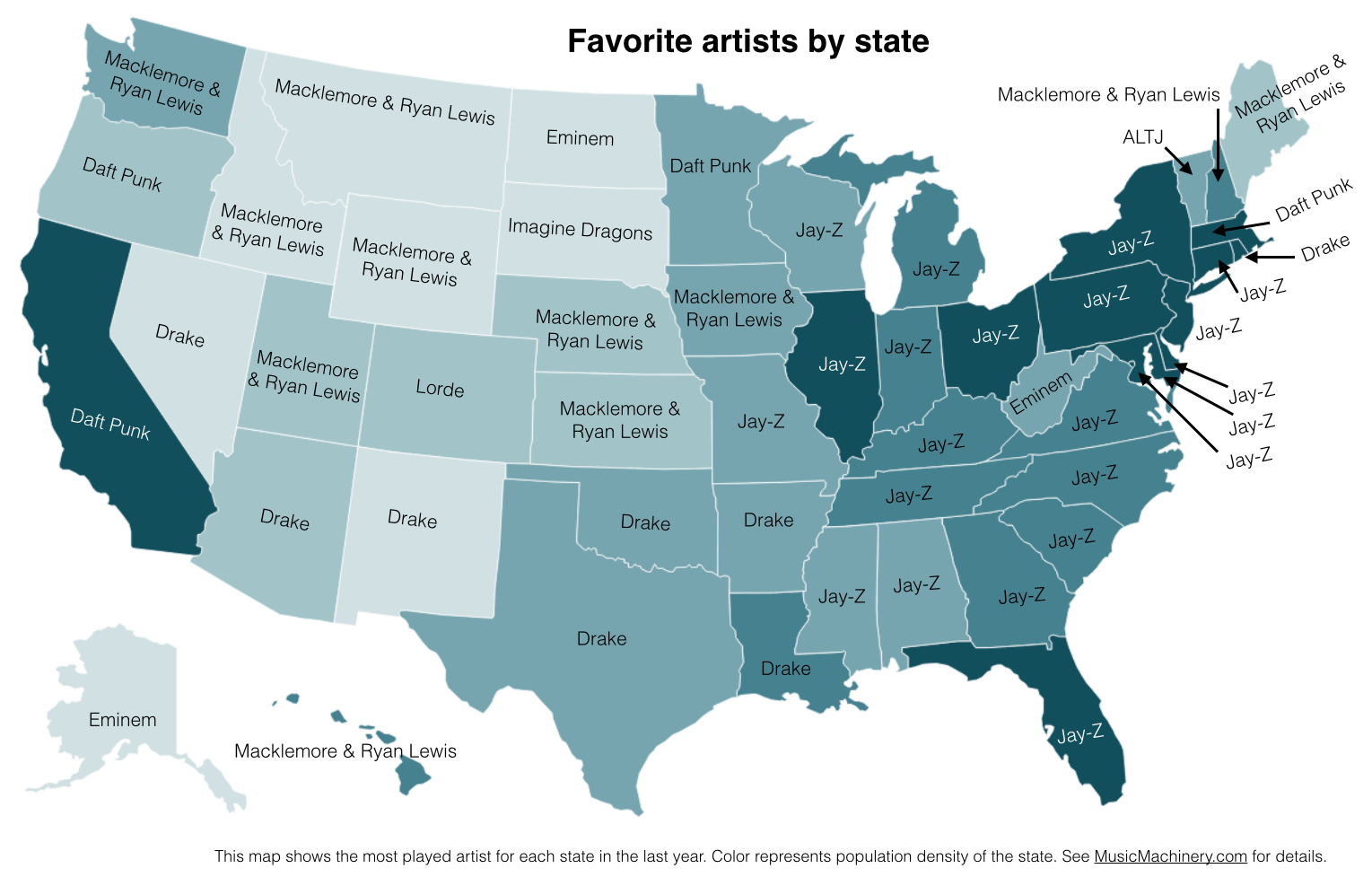
Favorite Artists vs Distinctive Artists by State
In my recent regional listening preferences post I published a map that showed the distinctive artists by state. The map was rather popular, but unfortunately was a source of confusion for some who thought that the map was showing the favorite artist by state. A few folks have asked what the map of favorite artists per state would look like and how it would compare to the distinctive map. Here are the two maps for comparison.
Favorite Artists by State
This map shows the most played artist in each state over the last year. It is interesting to see the regional differences in favorite artists and how just a handful of artists dominates the listening of wide areas of the country.
Most Distinctive Artists by State
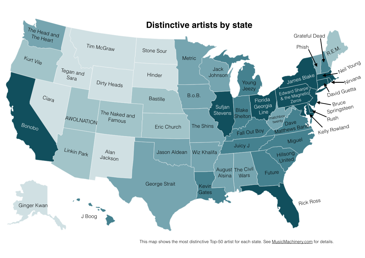
This is the previously published map that shows the artists that are listened to proportionally more frequently in a particular state than they are in all of the United States.
The data for both maps is drawn from an aggregation of data across a wide range of music services powered by The Echo Nest and is based on the listening behavior of a quarter million online music listeners.
It is interesting to see that even when we consider just the most popular artists, we can see regionalisms in listening preferences. I’ve highlighted the regions with color on this version of the map:
Favorite Artist Regions