Archive for category zero ui
The Skip
 At the time when I was coming of age musically, when we listened to music on LPs, the listening experience was very different than it is today. For one, if you didn’t like the currently playing song you had to get out of your chair, walk over to the turntable, carefully pick up the tone arm and advance the needle to the next track. That was a lot of work to avoid three minutes of bad music. You really had to really dislike a song to make skipping it worth the effort. Today, with our fancy iPhones and our digital streaming music subscription services, skipping a song couldn’t be easier. Just tap a button and you are on to the next song. The skip button is now a big part of the overall listening experience. Don’t like a song? Skip it. Never heard a song? Skip it. Just heard a song? Skip it. The Skip even plays a role in how we we pay for music. For most music subscription services if you want the freedom to skip a song whenever you want, you’ll need to be a premium subscriber, otherwise you’ll be limited to a half-dozen or so skips per hour.
I am interested in how people are using the skip button when listening to music so I spent a bit of time taking a closer look at skip data. This and the next blog post or two will be all about the skipping behavior of music listeners. We’ll take a look at how often people skip, whether different listener demographics have different skipping behavior, what artists and genres are most and least likely to trigger skips and more!
The Data
This is my first deep dive into Spotify data. The Spotify team has built up a fantastic big data infrastructure making it easy to extract insights from the billions and billions of music plays. For this study I’ve processed several billions of plays from many million unique listeners from all around the world.
What is a skip?
For this study, I define a skip as any time the listener abandons a song before the song finishes. It could be because the listener explicitly presses the skip button, or it could be that they searched for and started another song before the current song finished, or they clicked on a different song in the playlist. For whatever reason, if the listener doesn’t make it to the end of the song, I call it a skip.
How often do people skip?
The first and most basic question to answer is: How often do people skip?. Given that skipping is so easy how big of a part does skipping play in our listening. The answer: A lot!
Here are the numbers. First, lets look at how often a song is skipped within the first five seconds of play. I call these quick skips. The likelihood that a song will be skipped within the first five seconds is an astounding 24.14%. Nearly one quarter of all song plays are abandoned in the first 5 seconds. The likelihood that a song will be skipped within the first thirty seconds rises to 35.05%. The chance that a song is skipped before it ends is a whopping 48.6%. Yes, the odds are only slightly better than 50/50 that a song will be played all the way to the end.
| Skipped in | Likelihood of skip |
|---|---|
| First 5 seconds | 24.14 % |
| First 10 seconds | 28.97 % |
| First 30 seconds | 35.05 % |
| Before song finishes | 48.6 % |
The following plot shows the average skipping behavior for millions of listeners and billions of plays. The plot shows the rather steep drop off in listeners in the early part of a song when most listeners are deciding whether or not to skip the song. Then there’s a slow but steady decline in listeners until we reach the end of the song where only about 50% of the listeners remain.

The next plot shows the average skipping behavior within in the first 60 seconds of a song. It shows that most of the song skips happen within the first 20 seconds or so of the song, and after that there’s a relatively small but steady skipping rate.

We can also calculate an overall skip rate per listener – that is, the average number of times a listener skips a song per hour.
Average listener/skips per hour: 14.65
On average a listener is skipping a song once every four minutes. That’s a whole lot of skipping.
Who is doing all that skipping?
Do different types of listeners skip music at different rates? Lets take a look.
By Gender
Skipping rate of male listeners: 44.75%
Skipping rate of female listeners: 45.23%
There seems to be little difference as to how often men and women skip.
By Platform:
Desktop skipping rate: 40.1%
Mobile skipping rate: 51.1%
When we are at our desktops, we tend to settle into longer listening sessions and skip less, while when we are mobile we spend much more time interacting with our music.
By age:

This plot shows the skipping rate as a function of the age of the listener. It shows that young teenagers have the highest skipping rate – well above 50%, but as the listener gets older their skipping rate drops rather dramatically, to reach the skipping nadir of about 35%. Interestingly, the skipping rate rises again for people in their late 40s and early 50s. I have a couple of theories about why this might be. The first theory is that the skipping rate is a indication of how much free time a person has time. Teenagers skip more because they have more time to devote to editing their music stream, whereas thirty-somethings, with their little kids and demanding jobs, have no time to pay attention to their music players. The second theory, suggested by Spotify über-analyst Chris Tynan, is that the late-forties skipping resurgence is caused by teenagers that use their parent’s account.
When do people skip the most?
The following plot shows the skipping behavior over a 24 hour period. To create the plot, I analyzed the listening behavior for UK residents (which are conveniently confined to a single timezone) over several weeks.

The plot shows that the skipping rate is lowest when people are paying less attention to music – like when they are asleep, or at work. Skipping behavior peaks in the morning hour as people start they day and start to head into work and again at the end of the day when they are at home or out socializing with their friends. The plot shows the time of day when people tend to have the most attention to devote to hand-curating their music stream. When people are sleeping or working, their skip rate goes down.
In the next plot, below, the skipping rate is overlaid with normalized song plays. It is interesting to see that the highest skipping rates do not coincide with the peak music playing times of the day, but instead is aligned with the times of day when rate of change in plays is the most.

Skipping behavior by Day of the Week
The following plot shows the average skipping rate per day of the week. The skipping rate is higher on weekends, showing, once again, that when people have more spare time, they are more apt to curate their listening sessions by skipping tracks.

Take away
The Skip really has changed how we listened to music. It plays a significant role in how we interacts with our music stream. When we are more engaged with our music – we skip more, and when music is in the background such as when we are working or relaxing, we skip less. When we have more free time, such as when we are young, or on the weekends, or home after a day of work, we skip more. That’s when we have more time to pay attention to our music. The big surprise for me is how often we skip. On average, we skip nearly every other song that we play.
Skipping has become an important part of how we listen to music. It is no surprise then, that ‘unlimited skipping’ is a feature used to entice people to upgrade to a premium paid account. And it may be one of the reasons why people would switch from a service that doesn’t offer unlimited skips even on their premium service to one that does.
Coming soon: Look for my next post that will look at which genres, songs and artists get skipped the most and the least.
Beyond the Play Button – the future of listening
I’ve created a page with all the supporting info for my SXSW Talk called Beyond The Play Button – the future of listening.
Beyond the Play Button – the future of listening
The page contains slides, links to all supporting data and links to all apps demoed.
Anti-preferences in regional listening
Posted by Paul in data, The Echo Nest, zero ui on February 28, 2014
In previous posts, we’ve seen that different regions of the country can have different listening preferences. So far we’ve looked at the distinctive artists in any particular region. Perhaps equally interesting is to look at artists that get much fewer listens in a particular region than you would expect. These are the regional anti-preferences, the artists that are generally popular across the United States, but get much less love in a particular part of the country.
To find these artists, we merely look for artists that drop the furthest in rank on the top-most-played chart for a region when compared to the whole U.S. For example, we can look at the top 50 artists in the United States, and find those artists of the 50 that drop furthest in rank on the New Hampshire chart. Try it yourself. Here are the results:
Artists listened to more in United States than they are in New Hampshire
| # | Artist | Rank in United States |
Rank in New Hampshire |
Delta |
|---|---|---|---|---|
| 1 | R. Kelly | 42 | 720 | -678 |
| 2 | 2Pac | 45 | 243 | -198 |
| 3 | Usher | 46 | 205 | -159 |
| 4 | Coldplay | 36 | 155 | -119 |
| 5 | Chris Brown | 37 | 120 | -83 |
R. Kelly is ranked the 42nd most popular artist in the U.S., but in New Hampshire he’s the 720th most popular, a drop of 678 positions on the chart making him the most ignored artist in New Hampshire.
We can do this for each of the states in the United States and of course we can put them on a map. Here’s a map that shows the most ignored artist of the U.S. top-50 artist in each state.
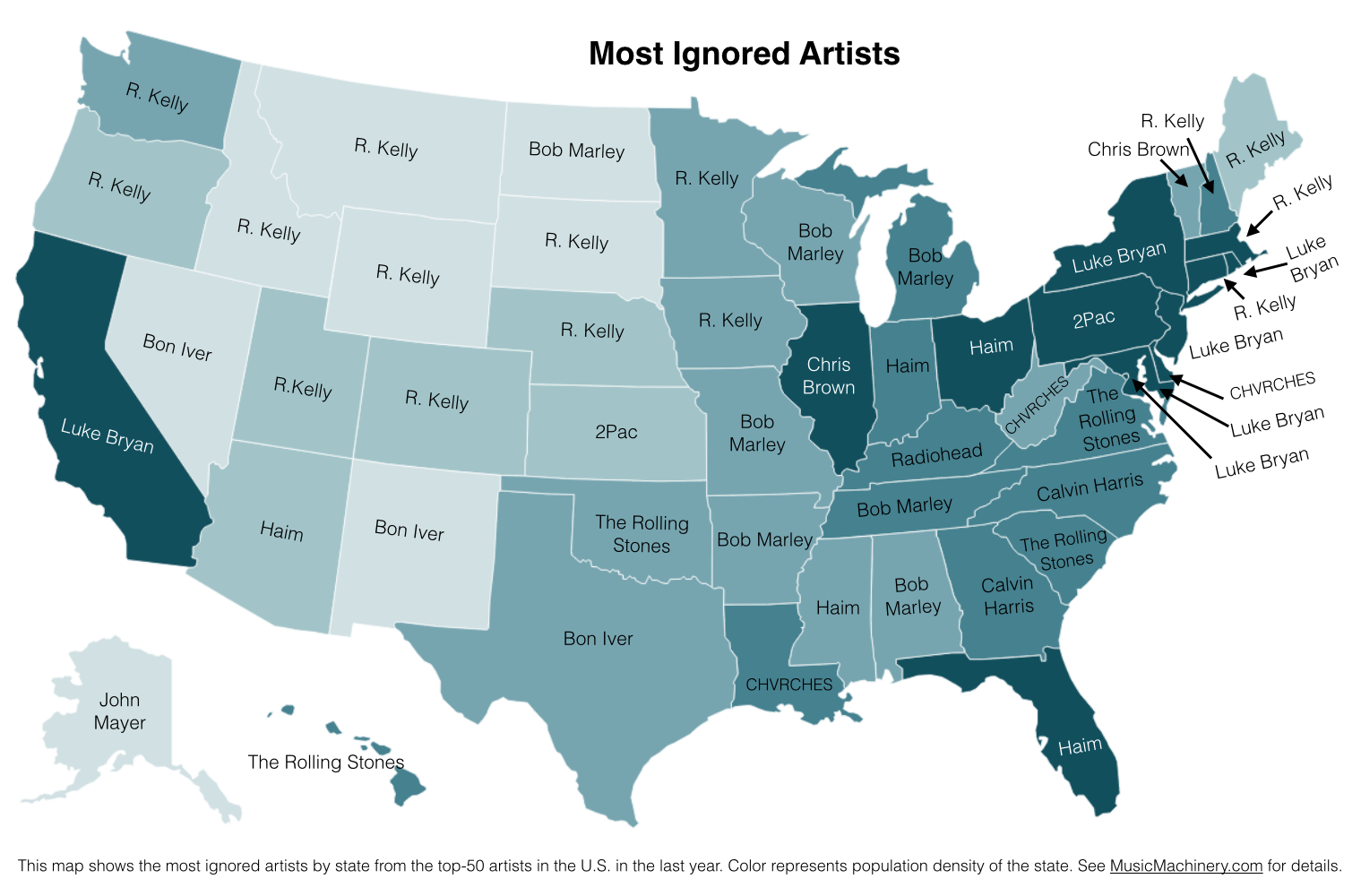
What can we do with this information? If we know where a music listener lives, but we know nothing else about them, we can potentially improve their listening experience by giving them music based upon their local charts instead of the global or national charts. We can also improve the listening even if we don’t know where the listener is from. As we can see from the map, certain artists are polarizing artists, liked in some circles and disliked in others. If we eliminate the polarizing artists for a listener that we know nothing about, we can reduce the risk of musically offending the listener. Of course, once we know a little bit about the music taste of a listener we can greatly improve their recommendations beyond what we can do based solely on demographic info such as the listener location.
Future work There are a few more experiments that I’d like to try with regard to exploring regional preferences. In particular I think it’d be fun to generate an artist similarity metric based solely on regional listening behaviors. In this world, Juicy J, the southern rapper, and Hillsong United, the worship band would be very similar since they both get lots of listens from people in Memphis. A few readers have suggested alternate scoring algorithms to try, and of course it would be interesting to repeat these experiments for other parts of the world. So much music data, so little time! However, this may be the last map I make for a while since the Internet must be getting sick of ‘artists on a map’ by now.
Credit and thanks to Randal Cooper (@fancycwabs) for creating the first set of anti-preference maps. Check out his blog and the Business Insider article about his work.
The data for the map is drawn from an aggregation of data across a wide range of music services powered by The Echo Nest and is based on the listening behavior of a quarter million online music listeners.
Favorite Artists vs Distinctive Artists by State
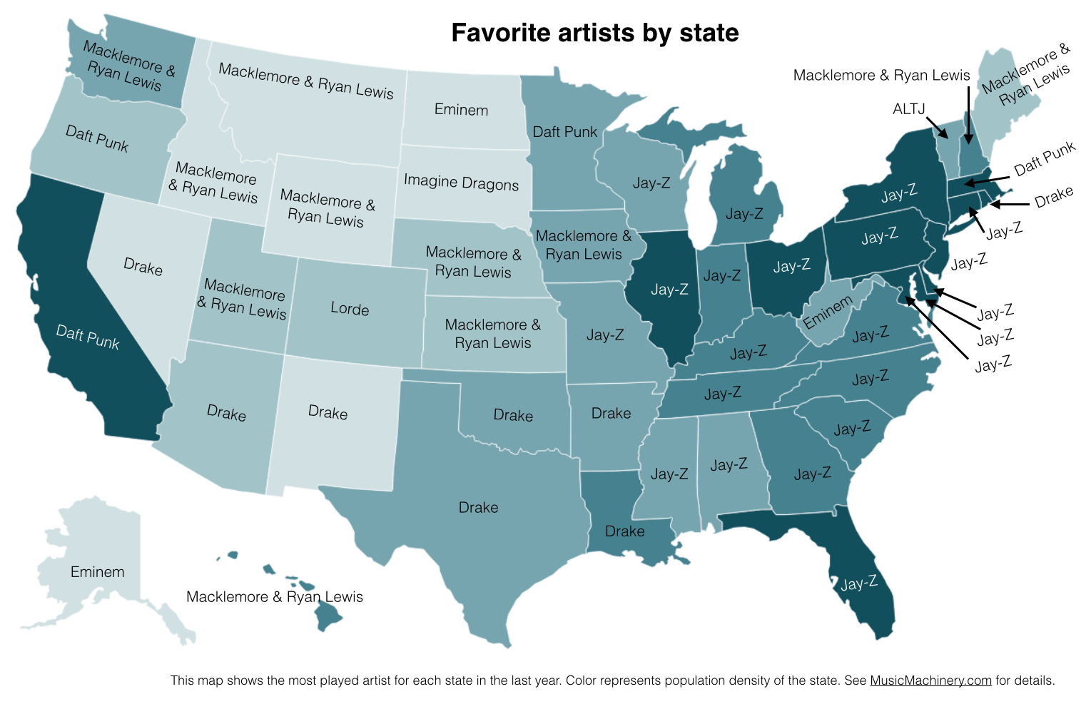
In my recent regional listening preferences post I published a map that showed the distinctive artists by state. The map was rather popular, but unfortunately was a source of confusion for some who thought that the map was showing the favorite artist by state. A few folks have asked what the map of favorite artists per state would look like and how it would compare to the distinctive map. Here are the two maps for comparison.
Favorite Artists by State
This map shows the most played artist in each state over the last year. It is interesting to see the regional differences in favorite artists and how just a handful of artists dominates the listening of wide areas of the country.
Most Distinctive Artists by State
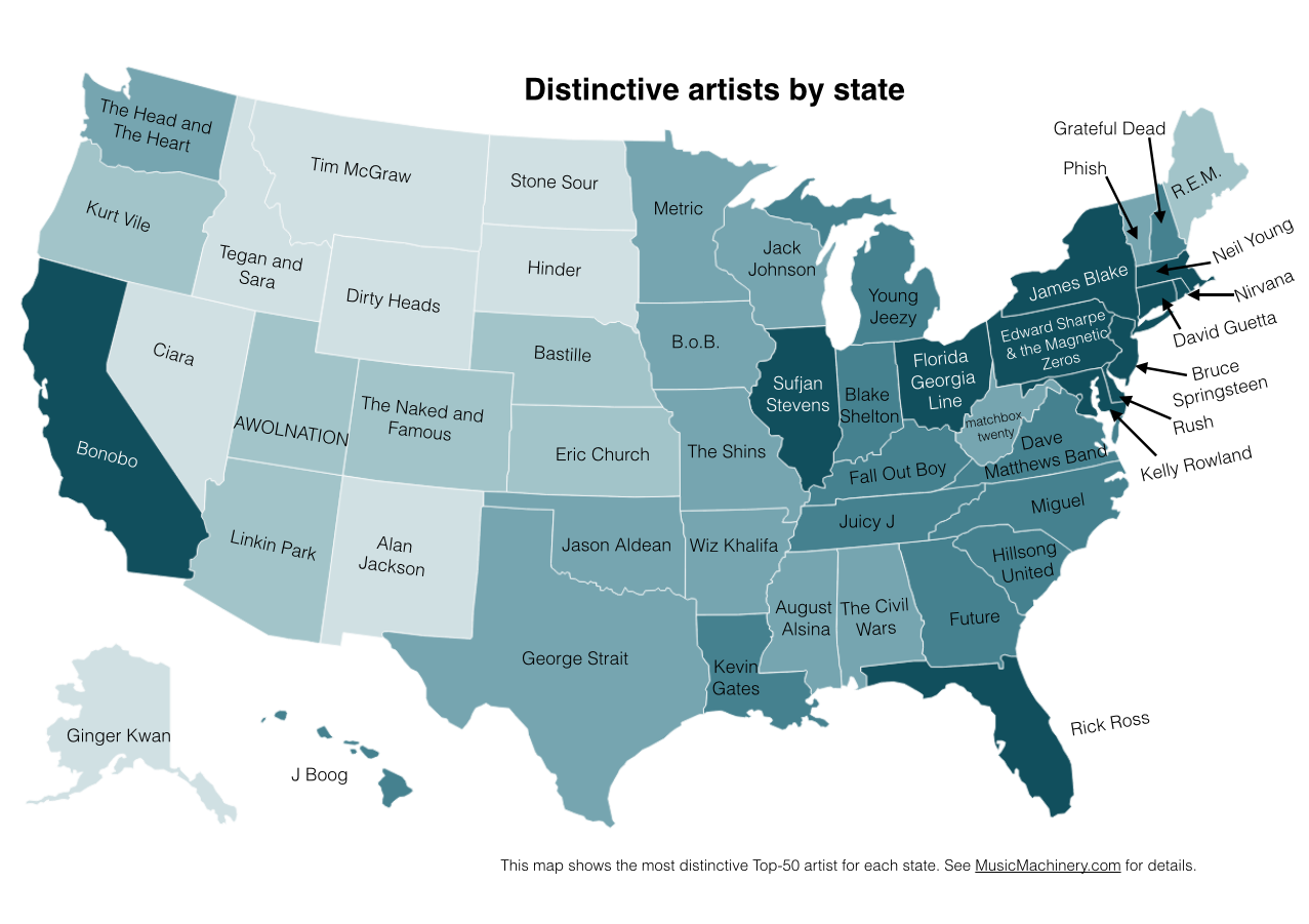
This is the previously published map that shows the artists that are listened to proportionally more frequently in a particular state than they are in all of the United States.
The data for both maps is drawn from an aggregation of data across a wide range of music services powered by The Echo Nest and is based on the listening behavior of a quarter million online music listeners.
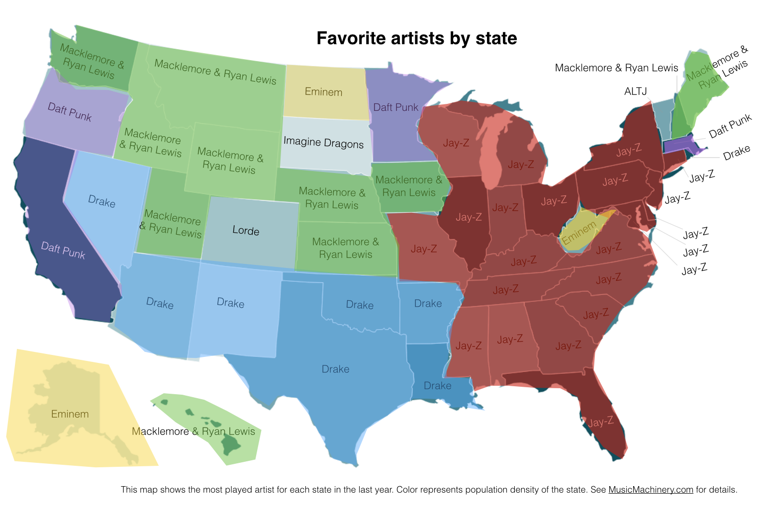
It is interesting to see that even when we consider just the most popular artists, we can see regionalisms in listening preferences. I’ve highlighted the regions with color on this version of the map:
Favorite Artist Regions
Exploring age-specific preferences in listening
Earlier this week we looked at how gender can affect music listening preferences. In this post, we continue the tour through demographic data and explore how the age of the listener tells us something about their music taste.
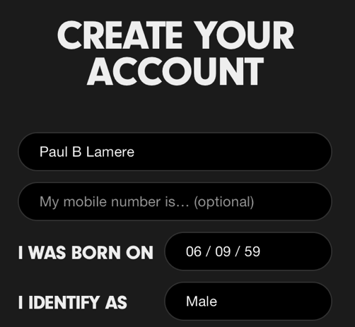
Where does the age data come from? As part of the enrollment process for most music services, the user is asked for a few pieces of demographic data, including gender and year-of-birth. As an example, here’s a typical user-enrollment screen from a popular music subscription service:
Is this age data any good? The first thing we need to do before we get too far with analyzing the age data is to get a feel for how accurate it is. If new users are entering random values for their date of birth then we won’t be able to use the listener’s age for anything useful. For this study, I looked at the age data submitted by several million listeners. This histogram shows the relative number of users by year of birth.
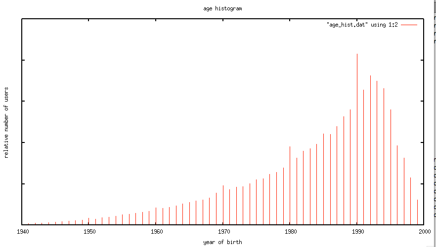
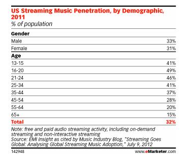
The first thing I notice is the curve has the shape one would expect. The number of listeners in each age bucket increases as the listener gets younger until around age 21 or so, at which points it drops off rapidly. The shape of the curve aligns with the data from this study by EMI in 2011 that shows the penetration of music streaming service by age demographic. This is a good indicator that our age data is an accurate representation of reality.
However, there are a few anomalies in the age data. There are unexpected peaks at each decade – likely due to people rounding their birth year to the nearest decade. A very small percentage (0.01 %) indicate that they are over 120 years old, which is quite unlikely. Despite this noise, the age data looks to be a valid and fairly accurate representation, in the aggregate, of the age of listeners. We should be able to use this data to understand how age impacts listening.
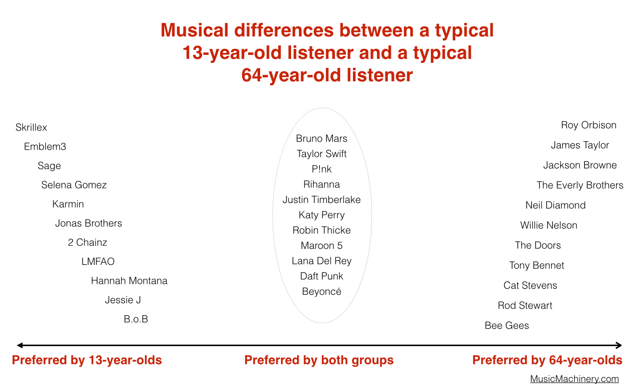
Does a 64-year-old listen to different music than a 13-year-old?
One would expect that people of different ages would have different music tastes. Let’s see if we can confirm this with our data. For starters, lets compare the average listening habits of 64-year-old listeners to that of the aggregate listening habits of the 13-year-old listener. For this experiment I selected 5,000 listeners in each age category, and aggregated their normalized artist plays to find the most-frequently-played artists. As expected, you can see that 64-year-old listeners have different tastes than 13-year-old listeners.
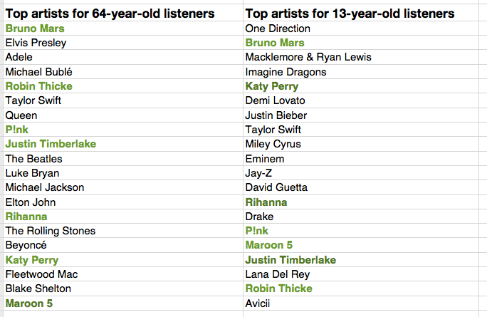
The top artists for the average 64-year-old listener include a mix of currently popular artists along with a number of artists from years gone by. While the top artists for the average 13-year-old includes only the most current artists. Still, there are seven artists (shown in bold) that overlap in the top 20 – an overlap rate of about 35%. This 35% overlap is consistent across all ranges of top artists for the two groups. No matter if we look at the top 100 or the top 1000 artists – there’s about a 35% overlap between the listening of 13- and 64-year-olds.

I suspect that 35% overlap is actually an overstatement of the real overlap between 13- and 64-year-olds. There are a few potential confounding effects:
- There’s a built-in popularity bias in music services. If you go to any popular music service you will see that they all feature a number of playlists filled with popular music. Playlists like The Billboard Top 100, The Viral 50, The Top Tracks, Popular New Releases etc. populate the home page or starting screen for most music services. This popularity bias inflates the apparent interest in popular music so, for instance, it may look like a 64-year-old is more interested in popular music than they really are because they are curious about what’s on all of those featured playlists.
- The age data isn’t perfect – for instance, there are certainly a number of people that we think are 64-years-old but are not. This will skew the results to artists that are more generally popular. We don’t really know how big this affect is, but it is certainly non-zero.
- People share listening accounts – this is perhaps the biggest confounding factor – that 64-year-old listener may be listening to music with their kids, their grand-kids, their neighbors and friends which means that not all of those plays should count as plays by a 64-year-old. Again, we don’t know how big this effect is, but it is certainly non-zero.
Let’s pause and have a listen to some music. First the favorite music of a typical 64-year-old listener:
And now the favorite music of a typical 13-year-old listener:
Finding the most distinctive artists
Perhaps more interesting than looking at how the two ages overlap in listening, is to look at how they differ – what are the artists that a 64-year-old will listen to that are rarely, if ever, listened to by a 13-year-old and vice versa. These are the most distinctive artists.

We can find the distinctive artists by identifying the artists in the top 100 of one group that fall the furthest in ranking in the other group. For example Skrillex is the 40th most listened to artist for the typical 13-year-old listener, but for 64-year-old listeners, Skrillex falls all the way to the 3,937 most listened to artist, making Skrillex one of the most distinguishing artist between the two groups of listeners. Likewise, Roy Orbison is the 42nd most listened to artist among 64-year-olds. He drops to position 4,673 among 13-year-olds making him one of the distinguishing artists that separate the 64-year-old from the 13-year-old.
We can use this technique to create playlists of artists that separate the 13-year-old from the 64-year-olds. Are you a 13-year-old, having a party and really wish that grandma would go to another room? Try this playlist:
Are you a 64-year-old and you want all of those 13 year-olds at the party to go home? Try this playlist:
We can also use this data to bring these two groups together. We can find the music that is liked the most among the two groups. We can do this by ordering artists by their worst ranking among the two groups. Artists like Skrillex and Roy Orbison fall to the bottom of the list since each is poorly ranked by one of the groups, while artists like Katy Perry and Bruno Mars rise to the top because they are favored by both groups.
Again, the confounding factors mentioned previously will bias the shared lists to more popular music. Nevertheless, if you are trying to make a playlist of music that will please both a 64-year-old and a 13-year-old, and you know nothing else about their music taste, this is probably your best bet.
Artists that are favored by both 64-year-old and 13-year-old listeners are: Bruno Mars, Taylor Swift, P!nk, Rihanna, Justin Timberlake, Katy Perry, Robin Thicke, Maroon 5, Lana Del Rey, Daft Punk, Beyoncé, Drake, Luke Bryan, Adele, Macklemore & Ryan Lewis, Miley Cyrus, David Guetta, Lorde, Jay-Z, Usher
We can sum up the differences between the two groups in this graphic:
Broadening our view
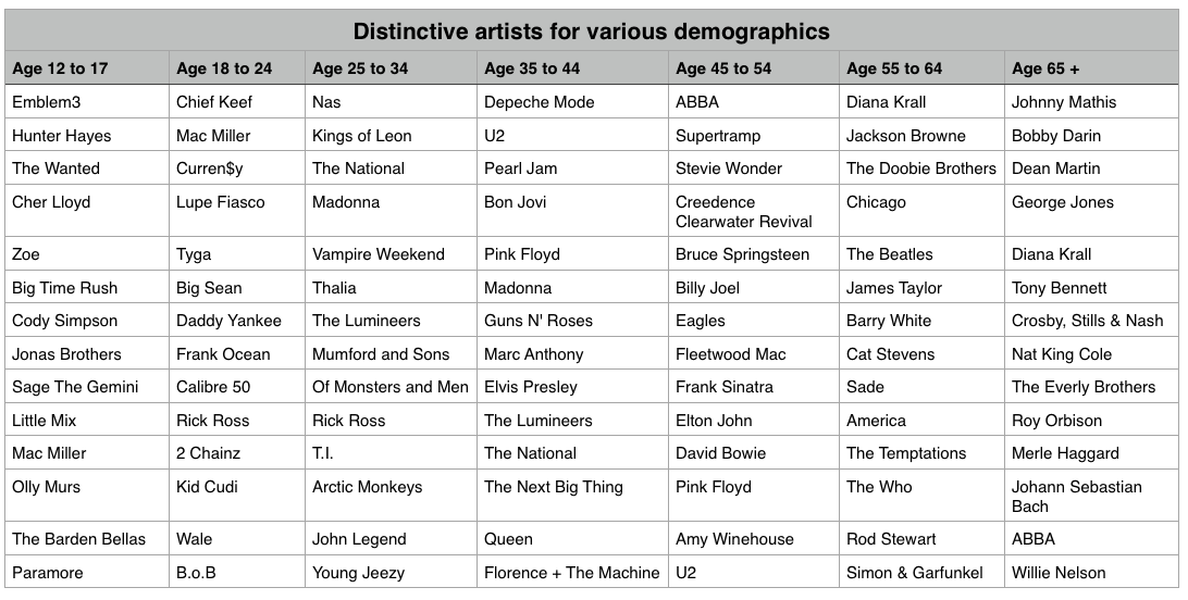
We’ve shown that, as expected, 13-year-olds and 64-year-olds have different listening preferences. We can apply the same techniques across the range of age demographics typically used by marketers. We can find the most distinctive artists for each demographic bucket. It is interesting to see the progression of music taste over time. For instance, it is clear that something happens to a music listener between the 25 to 34 and 35 to 44 age buckets. The typical listener goes from hipster (Lumineers, Vampire Weekend, The National), to old (Pearl Jam, U2, Bon Jovi).
It is interesting to look at the starting year for artists in each of these buckets to get a sense of how the artist’s own age relates to the age of their fans:
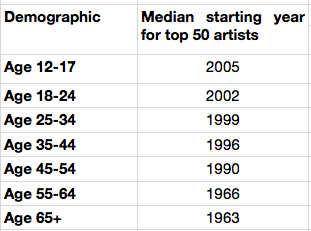
My take-way from this is that no matter how old you are, you don’t like the music from the 70s and the 80s so much.
Most homogenous Artists
We can also find the artists that are most acceptable across all demographics. These are the artists that are liked by more listeners in all of the groups. Like in the 13/64-year-old example, we can find these artists by ordering them by their worst ranking among all the demographic groups.
Most homogeneous artists: Bruno Mars, Rihanna, Katy Perry, Lana Del Rey, Beyoncé, P!nk, Jay-Z, Macklemore & Ryan Lewis, Daft Punk, Maroon 5, Justin Timberlake, Robin Thicke, David Guetta, Luke Bryan, Taylor Swift, Drake, Adele, Imagine Dragons, Miley Cyrus, Lorde
This is essentially the list of the most popular artists but with the most polarizing artists from any one demographic removed. If you don’t know the age of your listener, and you want to give the listener a low risk listening experience, these artists are a good place to start. And yes … this results in a somewhat bland, non-adventurous listening session – that’s the point. But as soon as you know a bit about the true listening preference of a new listener, you can pivot away from the bland and give them something much more in line with their music taste.
Rounding out the stats
There are a few more interesting bits of data we an pull out related to the age of the listener
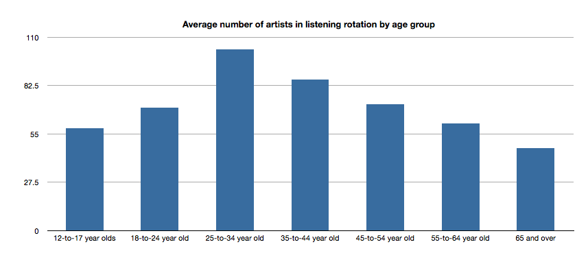
Average number of artists in listening rotation
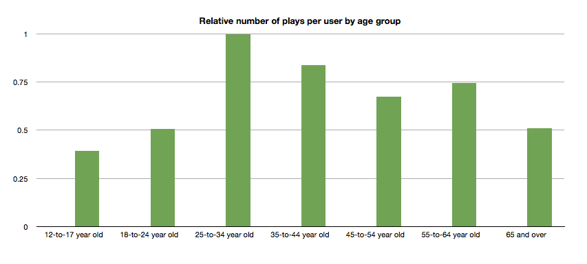
The typical 25- to 34-year old listener has more artists in active rotation than any other age group, while the 65+ listeners have the least.
Relative number of plays per user by age group
Likewise, the typical 25- to 34-year-old listener plays more music than any other category.
Tying it all up …
This quick tour through the ages confirms our thinking that the age of a listener plays a significant role in the type of music that they listen to. We can use this information to find music that is distinctive for a particular demographic. We can also use this information to help find artists that may be acceptable to a wide range of listeners. But we should be careful to consider how popularity bias may affect our view of the world. And perhaps most important of all, people don’t like music from the 70s or 80s so much.
Gender Specific Listening
Posted by Paul in data, Music, music information retrieval, recommendation, research, The Echo Nest, zero ui on February 10, 2014
One of the challenges faced by a music streaming service is to figure out what music to play for the brand-new listener. The first listening experience of a new listener can be critical to gaining that listener as a long time subscriber. However, figuring out what to play for that new listener is very difficult because often there’s absolutely no data available about what kind of music that listener likes. Some music services will interview the new listener to get an idea of their music tastes.
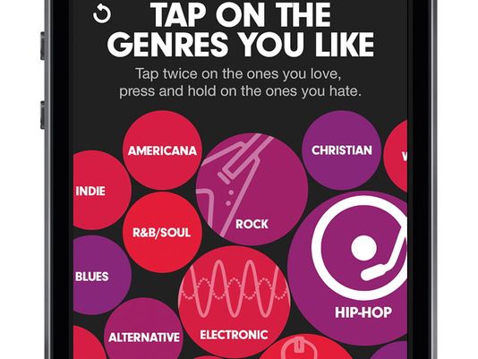
Selecting your favorite genres is part of the nifty user interview for Beat’s music
However, we’ve seen that for many listeners, especially the casual and indifferent listeners, this type of enrollment may be too complicated. Some listeners don’t know or care about the differences between Blues, R&B and Americana and thus won’t be able to tell you which they prefer. A listener whose only experience in starting a listening session is to turn on the radio may not be ready for a multi-screen interview about their music taste.
So what can a music service play for a listener when they have absolutely no data about that listener? A good place to start is to play music by the most popular artists. Given no other data, playing what’s popular is better than nothing. But perhaps we can do better than that. The key is in looking at the little bit of data that a new listener will give you.
For most music services, there’s a short user enrollment process that gets some basic info from the listener including their email address and some basic demographic information. Here’s the enrollment box for Spotify:
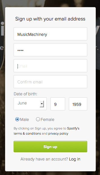
Included in this information is the date of birth and the gender of the listener. Perhaps we can use basic demographic data to generate a slightly more refined set of artists. For starters, lets consider gender. Let’s try to answer the question: If we know that a listener is male or female does that increase our understanding of what kind of music they might like? Let’s take a look.
Exploring Gender Differences in Listening
Do men listen to different music than women do? Anecdotally, we can think of lots of examples that point to yes – it seems like more of One Direction’s fans are female, while more heavy metal fans are male, but lets take a look at some data to see if this is really the case.
The Data – For this study, I looked at the recent listening of about 200 thousand randomly selected listeners that have self-identified as either male or female. From this set of listeners, I tallied up the number of male and female listeners for each artist and then simply ranked the artists in order or listeners. Here’s a quick look at the top 5 artists by gender.
Top 5 artists by gender
| Rank | All | Male | Female |
|---|---|---|---|
| 1 | Rihanna | Eminem | Rihanna |
| 2 | Bruno Mars | Daft Punk | Bruno Mars |
| 3 | Eminem | Jay-Z | Beyoncé |
| 4 | Katy Perry | Bruno Mars | Katy Perry |
| 5 | Justin Timberlake | Drake | P!nk |
Among the top 5 we see that the Male and Female listeners only share one artist in common:Bruno Mars. This trend continues as we look at the top 40 artists. Comparing lists by eye can be a bit difficult, so I created a slopegraph visualization to make it easier to compare. Click on this image to see the whole slopegraph:

click for full chart
Looking at the top 40 charts artists we see that more than a quarter of the artists are gender specific. Artists that top the female listener chart but are missing on the male listener chart include: Justin Bieber, Demi Lovato, Shakira, Britney Spears, One Direction, Christina Aguilera, Ke$ha, Ciara, Jennifer Lopez, Avril Lavigne and Nicki Minaj. Conversely, artists that top the male listener chart but are missing on the top 40 female listener chart include: Bob Marley, Kendrick Lamar, Wiz Khalifa, Avicii, T.I. Queen, J.Cole, Linkin Park, Kid Cudi and 50 Cent. While some artists seem to more easily cross gender lines like Rihanna, Justin Timberlake, Lana Del Rey and Robin Thicke.
No matter what size chart we look at – whether it is the top 40, top 200 or the top 1000 artists – about 30% of artists on a gender-specific chart don’t appear on the corresponding chart for the opposite gender. Similarly, about 15% of the artists that appear on a general chart of top artists will be of low relevance to a typical listener based on these gender-listening differences.
What does this all mean? If you don’t know anything about a listener except for their gender, you can reduce the listener WTFs by 15% for a typical listener by restricting plays to artists from the gender specific charts. But perhaps even more importantly, we can use this data to improve the listening experience for a listener even if we don’t know a listener’s gender at all. Looking at the data we see that there are a number of gender-polarizing artists on any chart. These are artists that are extremely popular for one gender, but not popular at all for the other. Chances are that if you play one of these polarizing artists for a listener that you know absolutely nothing about, 50% of the time you will get it wrong. Play One Direction and 50% of the time the listener won’t like it, just because 50% of the time the listener is male. This means that we can improve the listening experience for a listener, even if we don’t know their gender by eliminating the gender skewing artists and replacing them with more gender neutral artists.
Let’s see how this would affect our charts. Here are the new Top 40 artists when we account for gender differences.
| Rank | Old Rank | Artist |
|---|---|---|
| 1 | 2 | Bruno Mars |
| 2 | 1 | Rihanna |
| 3 | 5 | Justin Timberlake |
| 4 | 4 | Katy Perry |
| 5 | 6 | Drake |
| 6 | 15 | Chris Brown |
| 7 | 3 | Eminem |
| 8 | 8 | P!nk |
| 9 | 11 | David Guetta |
| 10 | 14 | Usher |
| 11 | 17 | Maroon 5 |
| 12 | 7 | Jay-Z |
| 13 | 13 | Adele |
| 14 | 9 | Beyoncé |
| 15 | 12 | Lil Wayne |
| 16 | 23 | Lana Del Rey |
| 17 | 25 | Robin Thicke |
| 18 | 24 | Pitbull |
| 19 | 27 | The Black Eyed Peas |
| 20 | 19 | Lady Gaga |
| 21 | 20 | Michael Jackson |
| 22 | 10 | Daft Punk |
| 23 | 18 | Miley Cyrus |
| 24 | 22 | Macklemore & Ryan Lewis |
| 25 | 28 | Coldplay |
| 26 | 16 | Taylor Swift |
| 27 | 26 | Calvin Harris |
| 28 | 21 | Alicia Keys |
| 29 | 29 | Imagine Dragons |
| 30 | 30 | Britney Spears |
| 31 | 44 | Ellie Goulding |
| 32 | 31 | Kanye West |
| 33 | 42 | J. Cole |
| 34 | 41 | T.I. |
| 35 | 52 | LMFAO |
| 36 | 32 | Shakira |
| 37 | 35 | Bob Marley |
| 38 | 54 | will.i.am |
| 39 | 36 | Ke$ha |
| 40 | 39 | Wiz Khalifa |
Artists promoted to the chart due to replace gender-skewed artists are in bold. Artists that were dropped from the top 40 are:
- Avicii – skews male
- Justin Bieber – skews female
- Christina Aguilera – skews female
- One Direction – skews female
- Demi Lovato – skews female
Who are the most gender skewed artists?
The Top 40 is a fairly narrow slice of music. It is much more interesting to look at how listening can skew across a much broader range of music. Here I look at the top 1,000 artists listened to by males and the top 1,000 artists listened to by females and find the artists that have the largest change in rank as they move from the male chart to the female chart. Artists that lose the most rank are artists that skew male the most, while artists that gain the most rank skew female.
Top male-skewed artists:
artists that skew towards male fans
- Iron Maiden
- Rage Against the Machine
- Van Halen
- N.W.A
- Jimi Hendrix
- Limp Bizkit
- Wu-Tang Clan
- Xzibit
- The Who
- Moby
- Alice in Chains
- Soundgarden
- Black Sabbath
- Stone Temple Pilots
- Mobb Deep
- Queens of the Stone Age
- Ice Cube
- Kavinsky
- Audioslave
- Pantera
Top female-skewed artists:
artists that skew towards female fans
- Danity Kane
- Cody Simpson
- Hannah Montana
- Emily Osment
- Playa LImbo
- Vanessa Hudgens
- Sandoval
- Miranda Lambert
- Sugarland
- Aly & AJ
- Christina Milian
- Noel Schajris
- Maria José
- Jesse McCartney
- Bridgit Mendler
- Ashanti
- Luis Fonsi
- La Oreja de Van Gogh
- Michelle Williams
- Lindsay Lohan
Gender-skewed Genres
By looking at the genres of the most gender skewed artists we can also get a sense of which genres are most gender skewed as well. Looking at the genres of the top 1000 artists listened to by male listeners and the top 1000 artists with female listeners we identify the most skewed genres:
Genres most skewed to female listeners:
- Pop
- Dance Pop
- Contemporary Hit Radio
- Urban Contemporary
- R&B
- Hot Adult Contemporary
- Latin Pop
- Teen Pop
- Neo soul
- Latin
- Pop rock
- Contemporary country
Genres most skewed to male listeners:
- Rock
- Hip Hop
- House
- Album Rock
- Rap
- Pop Rap
- Indie Rock
- Funk Rock
- Gangster Rap
- Electro house
- Classic rock
- Nu metal
Summary
This study confirms what we expected – that there are differences in gender listening. For mainstream listening about 30% of the artists in a typical male’s listening rotation won’t be found in a typical female listening rotation and vice versa. If we happen to know a listener’s gender and nothing else, we can improve their listening experience somewhat by replacing artists that skew to the opposite gender with more neutral artists. We can even improve the listening experience for a listener that we know absolutely nothing about – not even their gender – by replacing gender-polarized artists with artists that are more accepted by both genders.
Of course when we talk about gender differences in listening, we are talking about probabilities and statistics averaged over a large number of people. Yes, the typical One Direction fan is female, but that doesn’t mean that all One Direction fans are female. We can use gender to help us improve the listening experience for a brand new user, even if we don’t know the gender of that new user. But I suspect the benefits of using gender for music scheduling is limited to helping with the cold start problem. After a new user has listened to a dozen or so songs, we’ll have a much richer picture of the type of music they listen to – and we may discover that the new male listener really does like to listen to One Direction and Justin Bieber and that new female listener is a big classic rock fan that especially likes Jimi Hendrix.
update – 2/13 – commenter AW suggested that the word ‘bias’ was too loaded a term. I agree and have changed the post replacing ‘bias’ with ‘difference’
The Zero Button Music Player
Posted by Paul in music information retrieval, playlist, recommendation, research, The Echo Nest, zero ui on January 14, 2014
Ever since the release of the Sony Walkman 35 years ago, the play button has been the primary way we interact with music. Now the play button stands as the last barrier between a listener and their music. Read on to find out how we got here and where we are going next.
 In the last 100 years, technology has played a major role in how we listen to and experience music. For instance, when I was coming of age musically, the new music technology was the Sony Walkman. With the Walkman, you could take your music with you anywhere. You were no longer tied to your living room record player to listen to your music. You no longer had to wait and hope that the DJ would play your favorite song when you were on the road. You could put your favorite songs on a tape and bring them with you and listen to them whenever you wanted to no matter where your were. The Sony Walkman really changed how we listened to music. It popularized the cassette format, which opened the door to casual music sharing by music fans. Music fans began creating mix tapes and sharing music with their friends. The playlist was reborn, music listening changed. All because of that one device.
 We are once again in the middle of music+technology revolution. It started a dozen years ago with the first iPod and it continues now with devices like the iPhone combined with a music subscription service like Spotify, Rdio, Rhapsody or Deezer. Today, a music listener armed with an iPhone and a ten dollar-a-month music subscription is a couple of taps away from being able to listen to almost any song that has ever been recorded. All of this music choice is great for the music listener, but of course it brings its own problems. When I was listening to music on my Sony Walkman, I had 20 songs to choose from, but now I have millions of songs to choose from. What should I listen to next? The choices are overwhelming. The folks that run music subscription services realize that all of this choice for their listeners can be problematic. That’s why they are all working hard to add radio features like Rdio’s You.FM Personalized Radio. Personalized Radio simplifies the listening experience – instead of having to pick every song to play, the listener only needs to select one or two songs or artists and they will be presented with an endless mix of music that fits well with initial seeds.
Helping listeners pick music is especially important when you consider that not all music listeners are alike, and that most listeners are, at best, only casual music fans. A study conducted in 2003 and again in 2006 by Emap (A UK-based Advertising agency), summarized here by David Jennings, identified four main types of music listeners. Jennings describes these four main listening types as:
-
Savants – for whom everything in life is tied up with music
-
Enthusiasts – Music is a key part of life but is balanced with other interests
-
Casuals – Music plays a welcoming role, but other things are far more important
-
Indifferents – Would not lose much sleep if music ceased to exist.
These four listener categories are an interesting way to organize music listeners, but of course, real life isn’t so cut and dried. Listener categories change as life circumstances change (have a baby and you’ll likely become a much more casual music listener) and can even change based on context (a casual listener preparing for a long road-trip may act like a savant for a few days while she builds her perfect road-trip playlist).
In 2006, the distribution of people across these 4 categories was as follows:
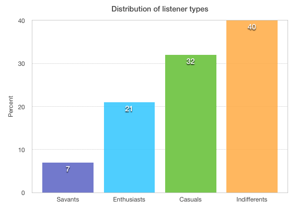
This chart says a lot about the music world and why it works the way it does. For instance, it gives us a guide as to how much different segments of the listening world are willing to pay for music in a year. On the chart below, I’ve added my estimate of the amount of money each listener type will spend on music in a year.

Savants will spend a thousand dollars or more on vinyl, concerts, and music subscriptions. Enthusiasts will spend $100 a year on a music subscription or, perhaps, purchase a couple of new tracks per week. Casuals will spend $10 a year (maybe splurge and buy that new Beyoncé album), while Indifferents will spend nothing on music. This is why music services like Spotify and Rdio have been exploring the Fremium model. If they want to enroll the 72% of people who are Casual or Indifferent music listeners, they need a product that costs much less than the $100 a year Enthusiasts are willing to pay.
However, price isn’t the only challenge music services face in attracting the Casuals and the Indifferents. Different types of listeners have a different tolerance around the amount of time and effort it takes to play music that they want to listen to.
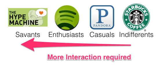
A music Savant – someone who lives, eats and breathes music – is happy spending hours a day poring through music blogs, forums and review sites to find new music, while the Indifferent music listener may not even make the simplest of efforts like turning the radio on or switching to a new station if they don’t like the current song. A simple metric for the time and effort spent is Interactions Per Listening Session. In this chart, I’ve added my estimate of the number of interactions, on average, a listener of a given type will tolerate to create a listening session.
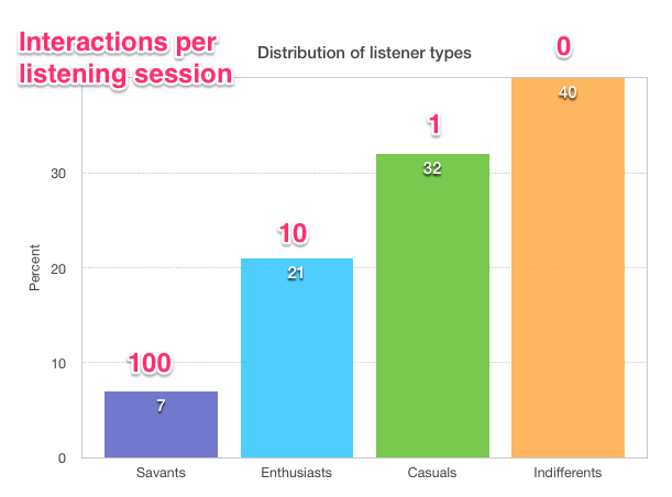
Interactions per Listening Session is an indication of how many times the listener controls their music player for a listening session. That music Savant may carefully handpick each song going into a playlist after reading a few music blogs and reviews about an artist on The Hype Machine, checking out the artist bio and previewing a few tracks. The music Enthusiast may grab a few top songs from a handful of their favorite artists to build a Spotify playlist. The casual listener may fire up Pandora, select an artist station and click play, while the Indifferent music listener may passively listen to the music that is playing on the radio or in the background at the local Starbucks.
The above chart shows why a music service like Pandora has been so successful. With its simple interface, Pandora is able to better engage the Casual listeners who don’t want to spend time organizing their listening session. A Pandora listener need only pick a station, and Pandora does all the work from there. This is why music subscription services hoping to attract more users are working hard to add Pandora-like features. In order to make their service appeal to the Casuals, they need to make it incredibly easy to have a good listening experience.
But what about those Indifferents? If 40% of people are indifferent to music, is this a lost market for music services? Is it impossible to reach people who can’t even be bothered to queue up some music on Pandora? I don’t think so. Over the last 75 years, terrestrial radio has shown that even the most indifferent music fan can be coaxed into simple, “lean back” listening. Even with all of the media distractions in the world today, 92% of Americans age 12 or older listen to the radio at least weekly, much the same as it was back in 2003 (94%).
So what does it take to capture the ears of Indifferents? First, we have to drive the out-of-pocket costs to the listener to zero. This is already being done via the Freemium model – Ad supported Internet radio (non-on-demand) is becoming the standard entry point for music services. Next, and perhaps more difficult, we have to drive the number of interactions required to listen to music to zero.
Thus my current project – Zero UI – building a music player that minimizes the interactions necessary to get good music to play – a music player that can capture the attention of even the musically indifferent.
Implicit signals and context
Perhaps the biggest challenge in creating a Zero UI music player is how to get enough information about the listener to make good music choices. If a Casual or Indifferent listener can’t be bothered to explicitly tell us what kind of music they like, we have to try to figure it out based upon implicit signals. Luckily, a listener gives us all kinds of implicit signals that we can use to understand their music taste. Every time a listener adjusts the volume on the player, every time they skip a song, every time they search for an artist, or whenever they abandon a listening session, they are telling us a little bit about their music taste. In addition to the information we can glean from a listener’s implicit actions, there’s another source of data that we can use to help us understand a music listener. That’s the listener’s music listening device – i.e. their phone.

The mobile phone is now and will continue to be the primary way for people to interact with and experience music. My phone is connected to a music service with 25 million songs. It ‘knows’ in great detail what music I like and what I don’t like. It knows some basic info about me such as my age and sex. It knows where I am, and what I am doing – whether I’m working, driving, doing chores or just waking up. It knows my context – the time of day, the day of the week, today’s weather, and my schedule. It knows that I’m late for my upcoming lunch meeting and it even might even know the favorite music of the people I’m having lunch with.
Current music interfaces use very little of the extra context provided by the phone to aid in music exploration and discovery. In the Zero UI project, I’ll explore how all of this contextual information provided by the latest devices (and near future devices) can be incorporated into the music listening experience to help music listeners organize, explore, discover and manage their music listening. The goal is to create a music player that knows the best next song to play for you given your current context. No button pressing required.
There are lots of really interesting areas to explore:
-
Can we glean enough signal from the set of minimal listener inputs?
-
Which context types (user activity, location, time-of-day, etc.) are most important for scheduling music? Will we suffer from the curse of dimensionality with too many contexts?
-
What user demographic info is most useful for avoiding the cold start problem (age, sex, zip code)?
-
How can existing social data (Facebook likes, Twitter follows, social tags, existing playlists) be used to improve the listening experience?
-
How can we use information from new wearable devices such as the Jawbone’s Up, the Fitbit, and the Pebble Smart Watch to establish context?
-
How do we balance knowing enough about a listener to give them good music playlists and knowing so much about a listener that they are creeped out about their ‘stalker music player’?
Over the next few months I’ll be making regular posts about Zero-UI. I’ll share ideas, prototypes and maybe even some code. Feel free to follow along.
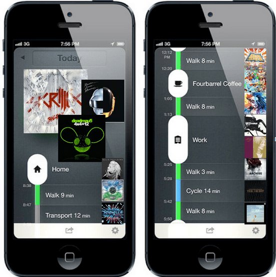
Conceptual zero-ui player that maps music listening onto user activity (as tracked by moves-app )
