In my recent regional listening preferences post I published a map that showed the distinctive artists by state. The map was rather popular, but unfortunately was a source of confusion for some who thought that the map was showing the favorite artist by state. A few folks have asked what the map of favorite artists per state would look like and how it would compare to the distinctive map. Here are the two maps for comparison.
Favorite Artists by State
This map shows the most played artist in each state over the last year. It is interesting to see the regional differences in favorite artists and how just a handful of artists dominates the listening of wide areas of the country.

Most Distinctive Artists by State
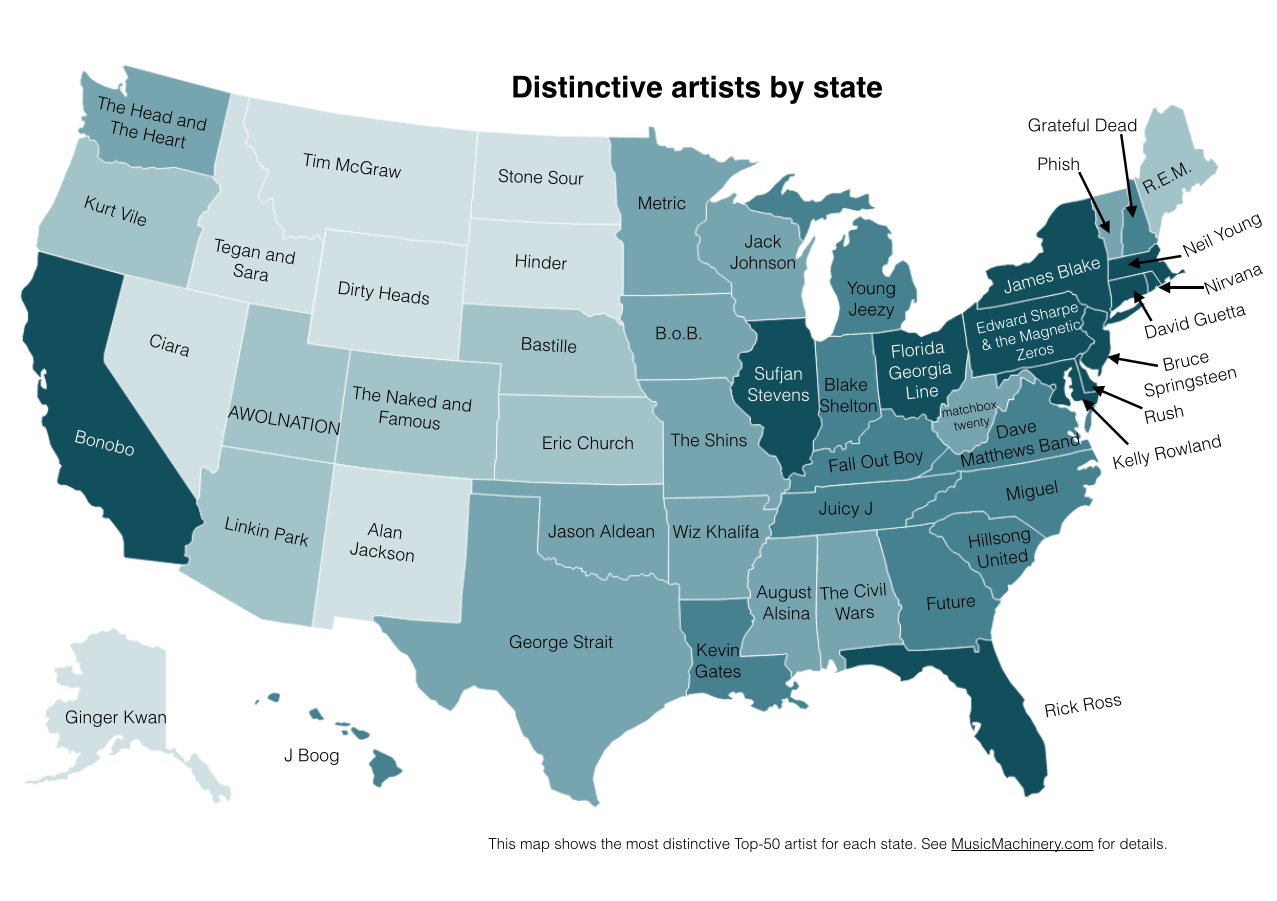
This is the previously published map that shows the artists that are listened to proportionally more frequently in a particular state than they are in all of the United States.
The data for both maps is drawn from an aggregation of data across a wide range of music services powered by The Echo Nest and is based on the listening behavior of a quarter million online music listeners.
It is interesting to see that even when we consider just the most popular artists, we can see regionalisms in listening preferences. I’ve highlighted the regions with color on this version of the map:
Favorite Artist Regions


#1 by Joe Momma on February 27, 2014 - 10:57 am
What the hell is a Drake?
#2 by cleverpunIlikeit on February 28, 2014 - 12:32 am
in english: a dragon or male duck. Also the name of a musician.
#3 by Brennan on February 27, 2014 - 11:27 am
The Lorde and AltJ “favorites” combined with the fast that some of the top 10 on spotify don’t make a single state http://news.yahoo.com/best-songs-2013-spotify-playlist-152114912.html make me think that this data might not be representative.
#4 by Brian Whitman (@bwhitman) on February 27, 2014 - 11:35 am
I like imagining the cluster map as a political electoral college map, with 4 major parties (Jay-Z, Drake, Macklemore & Daft Punk) — or maybe, a game of Risk.
#5 by Kelvin on February 27, 2014 - 1:25 pm
President Jay-Z already won with 287 electoral votes. Not to mention all the ineligble foreigners.
#6 by Waiting for better info. on February 27, 2014 - 11:50 am
Just like the last map previous to this, I find it interesting but not very relevant. I believe you stated “I sampled the listening preferences of about a quarter million listeners that have a zip code associated with their account”. Well that sure is great.. 1/4 Million people out of 300+ Million people? How can you arrive at any sort of pattern? There is no relevant or interesting information at all. What about age range, population density, frequency of listening, changes over time, comparison of services. What about the millions of people who actually make up more relevant data? Not everyone wants to make an account and then post their information. I did a “study” of my own and asked my friend to post to her facebook (having thousands of friends) asking people when the last time they listened to Jay Z was… the results? well 137/10,435 people responded. 28/137 Said they maybe listened to a song within the last month. The remainder said they rarely or never listen to Jay Z. Since my “study” was done by me and I don’t feel like posting any more, what If I made a map saying this information was accurate? My conclusion in that Jay Z is irrelevant because I took 5 minutes of my time to “study”. Waste of time.. in fact this whole thing is a waste of time. Thank you for wasting my time and those that read this useless garbage.
#7 by common sense on February 27, 2014 - 2:00 pm
so off of your complaint every study ever done in the history of man is wrong…. no study takes into account the whole population of a city state country etc etc. But rather they take a sample and either A. use a percentage or B inflate the numbers so they look like they represent a bigger picture.
Only reason his study wins over yours is a bigger sample size
As for a waste of time my argument goes back to the fact that… oh wait sounds like a personal problem.
come back when you know more about random studies and how they work
#8 by Anthony D. on February 28, 2014 - 8:26 pm
You apparently have zero idea on how polls/surveys are conducted. They’re all done with only sampling a few thousand people (i.e. most political polls), which statistically is accurate to +/- 3-4pts, which is enough to give you a fairly good idea of what they’re thinking. The fact that this person collected 250K data points probably makes it more accurate than most. Meanwhile, yours has 137 data points (which i think you’re making up anyways b/c FB limits the # of friends you have at 5K, unless you have a fan page, which brings up an entirely new set of questions, but i digress), which makes it statistically insignificant.
#9 by Waiting for better info. on March 1, 2014 - 12:21 pm
Like most people who believe in statistics being relevant, you both failed to grasp my point. There is not enough information provided to be even remotely interesting or relevant. A proper “study” would have included more than a map of the US with names on it. I find it very comical that you both only responded to one portion of what I wrote and decided you were totally awesome in making a response. It is funny that Anthony D. stated “which brings up an entirely new set of questions” which is exactly my point, unanswered questions means data is lacking. Thank you both for proving my entire argument which is that people look at a terrible misinformed article such as this and are left wanting. My example provided a perfect response and I am thrilled that you responded exactly as I would have expected.
#10 by Paul on March 1, 2014 - 12:49 pm
I’m sorry, but I’ve been pretty busy and can’t answer every question. Have I left a question of yours unanswered? If so, please repeat it. I prefer no name calling here though. As for providing ‘more than a map’ you can check out this app that lets you explore the data more deeply.
#11 by Anthony D. on March 1, 2014 - 12:35 pm
when I stated “brings up an entirely new set of questions”, I was referring to the possibility of your friend having a fan page on FB. If that is the case, and she indeed does have 10K+ fans/followers, what exactly do she do, or a fan of what genre of music? If she performs a genre of music that is vastly different than Jay-Z, say death speed metal or christian music, then polling her followers about Jay-Z would skew it because it’s a genre of music they most likely wouldn’t listen to. That would be like me going to a country music concert and asking people their thoughts on Metallica’s latest album, it’ll skew the data. For someone who says 3 times in 2 sentences “this is a waste of time”, you seem to be spending a lot of time complaining about what a waste of time the “study” was. Why not just close the browser tab and move onto something that’s worth more of your valuable time?
#12 by Brian on February 27, 2014 - 12:20 pm
JayZ sucks.
#13 by Captain Zoots (@Capzoots) on February 27, 2014 - 12:24 pm
Now I’m confused
#14 by zozopapa on February 27, 2014 - 3:05 pm
artists …hahaha
#15 by Phil Cady on February 27, 2014 - 3:33 pm
What the hell is a “Bonobo”? I’ve lived in Los Angeles 20 years and never heard of these freaks.
#16 by Nick Fackler on February 27, 2014 - 3:38 pm
This is the kind of research one would expect to see in a high school science fair. Websites have specific demographics making for a not-random sample population. Only using 250,000 people makes for a very small sample size. A good study would use a mix of different websites and would draw random users from those websites. It would also recognize that a certain population of people does not use the Internet, therefore the study will not be the favorite music of all people of the state only Internet radio users.
An acceptable name for these maps would be “Favorite artists by state of The Echo Nest users”. Overall, this research deserves a failing grade for attempting to pass it off as something it isn’t. Please, change the map names or retract this pitiful excuse for an article.
This reads more as an advertisement for The Echo Nest than anything else.
#17 by Waiting for better info. on March 1, 2014 - 12:25 pm
I agree entirely, although one thing to note is that The Echo Nest covers many platforms. Otherwise I do completely agree, this is a case of someone spending at least 30 minutes making a map with names on it and not providing any relevant data or even a well rounded article. I also fail this attempt. It is interesting when people spend such little time to write garbage then self promote on DIGG.
#18 by Waiting for better info. on March 1, 2014 - 12:34 pm
Also it is funny how the author obviously realizes this is an incomplete science fair project.. He responds to people who offer a positive reaction and who defend “statistics”. Clearly this is not a well rounded article and missing very much information, but the author apparently is ignoring that because of his incompetence.
#19 by mike on February 27, 2014 - 3:59 pm
I have a reasonable doubt regarding Jay-Z’s popularity
#20 by ponchat on February 27, 2014 - 4:04 pm
I enjoy seeing West Virginia have “matchbox twenty.” I always knew WV was behind the times.
#21 by fancycwabs on February 27, 2014 - 4:12 pm
I took the program and used it to generate data for which artists each state hates. Lots of states hate R. Kelly, until you get past the top 200 artists, then they hate Mary J. Blige (or sometimes George Strait).
Maps here: http://fancycwabs.com/post/77970260513/earlier-i-reblogged-a-post-about-who-your-state
#22 by Paul on February 27, 2014 - 4:13 pm
I saw your maps, they are nifty! If you don’t mind, I may redo one of those to match my other maps and do a blog post about it (recognizing your contribution of course).
#23 by fancycwabs on February 27, 2014 - 5:04 pm
By all means (sorry for the double post–I wasn’t sure the first one went through). I’d have taken better care to make them legible if I’d known they would get as much visibility.
#24 by Paul on February 27, 2014 - 8:42 pm
super stuff!
#25 by Maynard G. Kreps on February 27, 2014 - 9:38 pm
WIthin which demographic? Certainly not mine… I don’t listen to any of that crap.
#26 by Waiting for better info. on March 1, 2014 - 12:35 pm
Author will only respond to people who “like” him. Don’t ask question that should have been answered to begin with, he can’t compute intelligent questions.
#27 by Foxx Stephanie Queen-Pace on February 27, 2014 - 11:04 pm
where the devil is TRACE ADKINS.??? THIS IS ALSO NOT CORRECT
#28 by Sam on February 27, 2014 - 11:50 pm
both maps are all wrong
#29 by thegenyexp on February 28, 2014 - 12:56 am
macklemore daft punk and imagine dragons earned their place on the favourites list, can’t say the same about the rest
#30 by YEEZYSEASON on February 28, 2014 - 7:13 pm
I agree. This needs way more Kanye West
#31 by BigBlueNation on February 28, 2014 - 4:43 am
Why did you shade the states by population density? What is the significance of this? Thanks ..
#32 by Paul on February 28, 2014 - 8:19 am
its because I’m lazy. I started with a map that was showing the population, and I just went with it.
#33 by Waiting for better info. on March 1, 2014 - 12:36 pm
This sums up the entire article, you are lazy…
#34 by Scarves For Skanks on February 28, 2014 - 9:30 am
This has no way of being accurate in terms of all actual Americans. The poll involved only takes into account people that heavily rely on streaming or online downloads as their main means of receiving their music, therefore we only see bands from the last two generations. What about the 40 and older crowd? Highly doubt that they are jamming to the beats of Macklemore or……god save us….Jay-Z (One…maybe two good songs ever….)
In terms of this sampling, I would’ve liked to see the top three songs per state with the very same service. I’d really like to know why the eastern seaboard is still riding high on….Big Pimpin’ (ewwwww)
#35 by StatisticsIsFun! on February 28, 2014 - 12:14 pm
There is a severe misunderstanding of basic statistics in these comments…. Paul hasn’t suggested that the data is representative of every human being that listens to music. He very clearly states (in an earlier post) what the source and nature of the data is. If you’ve brought some assumptions regarding the data into the conversation, you’re not going to be able to converse intelligently about it. Paul works for the Echo Nest. His data is derived from the Echo Nest’s services. He hasn’t suggested otherwise.
#36 by Paul on February 28, 2014 - 12:21 pm
thanks for watching my back!
#37 by Waiting for better info. on March 1, 2014 - 12:30 pm
People are not misunderstanding statistics, they are left wanting much more information. This is a pathetic article, consisting of a few paragraphs and some grade school map of the US. The author (above) apparently spent so much time “researching” that he burnt himself out when it came time to write an article for the public. I have seem more statistical relevance on pamphlets tacked to the board at the laundromat. Forgive me for failing to see why there is any reason to suspect that this is a result of lack of dedication and a complete lack of understanding of how the masses view “data”… or in this case lack thereof.
#38 by John "jaQ" Andrews on February 28, 2014 - 12:31 pm
Whatever you think of the methodology or data set here, at least the media are capable of understanding words like “favorite”. A “data source” caption on the image itself might be nice, but anyone reading beyond the headline learns the full story. If you don’t mind, I’ll be linking these two blog entries in one of my own on Monday regarding media hyperbole and misrepresentation.
#39 by Paul on February 28, 2014 - 12:33 pm
Feel free to link. Looking forward to your observations.
#40 by Waiting for better info. on March 1, 2014 - 12:39 pm
Feel free to share and link this incompetent, pathetic attempt at statistics.
“its because I’m lazy.” – From the author.
This is perfect to link to for misrepresentation, because the data is also misrepresented.
#41 by Adelefan on March 1, 2014 - 1:47 pm
Where is Adele at!
#42 by matt stascavage on March 12, 2014 - 2:32 pm
This is great, I would like to look into the data a little deeper, the app is not loading. Is there another link?