Archive for category visualization
What’s your favorite visualization for music discovery?
Posted by Paul in Music, research, visualization on September 4, 2009
 Justin and I have been working on our tutorial on using visualizations for music discovery to be presented ISMIR 2009. One part of this tutorial will be a survey of current commercial and research-oriented systems that use visualization to help people explore for and discover new music. Ultimately we hope to build a comprehensive web directory of these visualization as part of the supplementary material for the tutorial. We could use your help building this directory. If you know of an interesting visualization that is used for music discovery (or even a technique that you think *could* be used for music discovery), add a link/description in the comments on this post or send me an email at paul.lamere@gmail.com. Thanks much!
Making better plots
Posted by Paul in code, fun, The Echo Nest, visualization on August 5, 2009
For many years, I’ve used awk and gnuplot to generate plots but as I switch over to using Python for my day to day programming, I thought there might be a more Pythonic way to do plots. Google pointed me to Matplotlib and after kicking the tires, I’ve decided to retire gnuplot from my programming toolkit and replace it with matplotlib.
Matplotlib is a 2D plotting library that produces a wide variety of high quality figures suitable for interactive applications or for inserting into publications. A quick tour of the gallery shows the wide range of plots that are possible with Matplotlib. The syntax for creating plots is simple and familiar to anyone who’s used matlab for plotting.
With this new tool in my programming pocket, I thought I’d update my click plotter program to use matplotlib. (The click plotter is a program that generates plots showing how a drummer’s BPM varies over the course of a song. By looking at the generated plots it is easy to see if the beat for a song is being generated by a man or a machine. Read more about it in ‘In Search of the Click Track‘).
The matplotlib code to generate the plots is straightforward:
def plot_click_track(filename): track = track_api.Track(filename) tempo = float(track.tempo['value']) beats = track.beats times = [ dict['start'] for dict in beats ] bpms = get_bpms(times)plt.title('Click Plot for ' + os.path.basename(filename)) plt.ylabel('Beats Per Minute') plt.xlabel('Time') plt.plot(times, get_filtered_bpms(bpms), label='Filtered') plt.plot(times, bpms, color=('0.8'), label='raw') plt.ylim(tempo * .9, tempo * 1.1) plt.axhline(tempo, color=('0.7'), label="Tempo") plt.show()The complete source code for click_plot is in the example directory of the pyechonest module.
Here are a few examples plots generated by click_plot:
To create your own click plots grab the example from the SVN repository, make sure you have pyechonest and matplotlib installed, get an Echo Nest API key and start generating click plots with the command:
% click_plot.py /path/to/music.mp3
Music Explorer FX
Posted by Paul in java, Music, recommendation, The Echo Nest, visualization on June 11, 2009
Sten has posted a link to his super nifty Music Explorer FX. Music Explorer FX is a Java Fx application for exploring and discovering music. In some ways, the application is like a much slicker version of Music Plasma or Musicovery. You can explore a particular neighborhood in the music world – looking at artist photos and videos, listening to music, reading reviews and blog posts, and following paths to similar artists. It’s a very engaging application that makes it easy to learn about new bands. I especially like the image gallery mode – when I find a band that I think might be interesting, I hit the play button to listen to their music, and then enter the image gallery to get a slide show of the band playing. Here’s an example of ‘Pull Tiger Tail’ – a band that I just learned about today while exploring with MEFX.
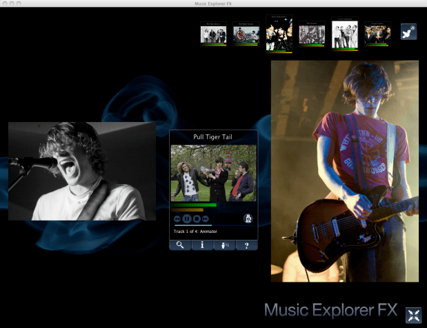
Sten uses a number of APIs to make MEFX happen. He uses the Echo Nest for artist search and to get all sorts of info including artist familiarity, hotness, artist similarity, blogs, news, reviews and audio. He gets artist images from Flickr and Last.fm – and just to make sure he’s relevant in this Twitter-centric world, he uses the Twitter API to let you tweet about any interesting paths you’ve taken through the music space.
We are living in a remarkable world now – there’s such an incredible amount of music available. There are millions of artists creating music in all styles. The challenge for today’s music listener is to find a way to navigate through this music space to find music that they will like. Traditional music recommenders can help, but I really think that applications like the MEFX that enable exploration of the music space are going to be important tools for the adventurous music listener
Building a music map
Posted by Paul in data, fun, java, Music, research, The Echo Nest, visualization, web services on May 31, 2009
I like maps, especially maps that show music spaces – in fact I like them so much I have one framed, hanging in my kitchen. I’d like to create a map for all of music. Like any good map, this map should work at multiple levels; it should help you understand the global structure of the music space, while allowing you to dive in and see fine detailed structure as well. Just as Google maps can show you that Africa is south of Europe and moments later that Stark st. intersects with Reservoir St in Nashua NH a good music map should be able to show you at a glance how Jazz, Blues and Rock relate to each other while moments later let you find an unknown 80s hair metal band that sounds similar to Bon Jovi.
My goal is to build a map of the artist space, one the allows you to explore the music space at a global level, to understand how different music styles relate, but then also will allow you to zoom in and explore the finer structure of the artist space.
I’m going to base the music map on the artist similarity data collected from the Echo Nest artist similarity web service. This web service lets you get 15 most similar artists for any artist. Using this web service I collected the artist similarity info for about 70K artists along with each artists familiarity and hotness.
Some Explorations
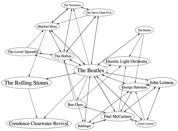
It would be silly to start trying to visualize 70K artists right away – the 250K artist-to-artist links would overwhelm just about any graph layout algorithm. The graph would look like this. So I started small, with just the near neighbors of The Beatles. (Beatles-K1) For my first experiment, I graphed the the nearest neighbors to The Beatles. This plot shows how the the 15 near neighbors to the Beatles all connect to each other.
In the graph, artist names are sized proportional to the familiarity of the artist. The Beatles are bigger than The Rutles because they are more familiar. I think the graph is pretty interesting, showing how all of the similar artists of the Beatles relate to each other, however, the graph is also really scary because it shows 64 interconnections for these 16 artists. This graph is just showing the outgoing links for the Beatles, if we include the incoming links to the Beatles (the artist similarity function is asymettric so outgoing similarities and incoming similarities are not the same), it becomes a real mess:
If you extend this graph one more level – to include the friends of the friends of The Beatles (Beatles-K2), the graph becomes unusable. Here’s a detail, click to see the whole mess. It is only 116 artists with 665 edges, but already you can see that it is not going to be usable.
Eliminating the edges
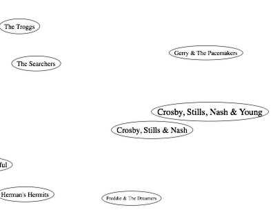
Clearly the approach of drawing all of the artist connections is not going to scale to beyond a few dozen artists. One approach is to just throw away all of the edges. Instead of showing a graph representation, use an embedding algorithm like MDS or t-SNE to position the artists in the space. These algorithms layout items by attempting to minimize the energy in the layout. It’s as if all of the similar items are connected by invisible springs which will push all of the artists into positions that minimize the overall tension in the springs. The result should show that similar artists are near each other, and dissimilar artists are far away. Here’s a detail for an example for the friends of the friends of the Beatles plot. (Click on it to see the full plot)
I find this type of visualization to be quite unsatisfying. Without any edges in the graph I find it hard to see any structure. I think I would find this graph hard to use for exploration. (Although it is fun though to see the clustering of bands like The Animals, The Turtles, The Byrds, The Kinks and the Monkeee).
Drawing some of the edges
We can’t draw all of the edges, the graph just gets too dense, but if we don’t draw any edges, the map loses too much structure making it less useful for exploration. So lets see if we can only draw some of the edges – this should bring back some of the structure, without overwhelming us with connections. The tricky question is “Which edges should I draw?”. The obvious choice would be to attach each artist to the artist that it is most similar to. When apply this to the Beatles-K2 neighborhood we get something like this:
This clearly helps quite a bit. We no longer have the bowl of spaghetti, while we can still see some structure. We can even see some clustering that make sense (Led Zeppelin is clustered with Jimi Hendrix and the Rolling Stones while Air Supply is closer to the Bee Gees). But there are some problems with this graph. First, it is not completely connected, there are a 14 separate clusters varying from a size of 1 to a size of 57. This disconnection is not really acceptable. Second, there are a number of non-intuitive flows from familiar to less familiar artists. It just seems wrong that bands like the Moody Blues, Supertramp and ELO are connected to the rest of the music world via Electric Light Orchestra II (shudder).
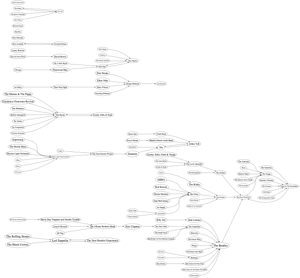
To deal with the ELO II problem I tried a different strategy. Instead of attaching an artist to its most similar artist, I attach it to the most similar artist that also has the closest, but greater familiarity. This should prevent us from attaching the Moody Blues to the world via ELO II, since ELO II is of much less familiarity than the Moody Blues. Here’s the plot:
Now we are getting some where. I like this graph quite a bit. It has a nice left to right flow from popular to less popular, we are not overwhelmed with edges, and ELO II is in its proper subservient place. The one problem with the graph is that it is still disjoint. We have 5 clusters of artists. There’s no way to get to ABBA from the Beatles even though we know that ABBA is a near neighbor to the Beatles. This is a direct product of how we chose the edges. Since we are only using some of the edges in the graph, there’s a chance that some subgraphs will be disjoint. When I look at the a larger neighborhood (Beatles-K3), the graph becomes even more disjoint with a hundred separate clusters. We want to be able to build a graph that is not disjoint at all, so we need a new way to select edges.
Minimum Spanning Tree
One approach to making sure that the entire graph is connected is to generate the minimum spanning tree for the graph. The minimum spanning tree of a graph minimizes the number of edges needed to connect the entire graph. If we start with a completely connected graph, the minimum spanning tree is guarantee to result in a completely connected graph. This will eliminate our disjoint clusters. For this next graph, built the minimum spanning tree of the Beatles-K2 graph.
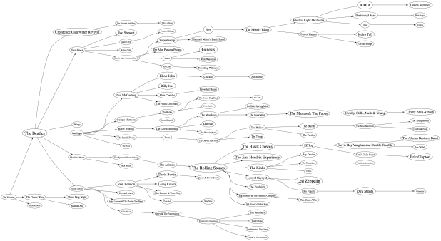
As predicted, we no longer have separate clusters within the graph. We can find a path between any two artists in the graph. This is a big win, we should be able to scale this approach up to an even larger number of artists without ever having to worry about disjoint clusters. The whole world of music is connected in a single graph. However, there’s something a bit unsatisfying about this graph. The Beatles are connected to only two other artists: John Lennon & The Plastic Ono Band and The Swinging Blue Jeans. I’ve never heard of the Swinging Blue Jeans. I’m sure they sound a lot like the Beatles, but I’m also sure that most Beatles fans would not tie the two bands together so closely. Our graph topology needs to be sensitive to this. One approach is to weight the edges of the graph differently. Instead of weighting them by similarity, the edges can be weighted by the difference in familiarity between two artists. The Beatles and Rolling Stones have nearly identical familiarities so the weight between them would be close to zero, while The Beatles and the Swinging Blue Jeans have very different familiarities, so the weight on the edge between them would be very high. Since the minimum spanning is trying to reduce the overall weight of the edges in the graph, it will chose low weight edges before it chooses high weight edges. The result is that we will still end up with a single graph, with none of the disjoint clusters, but artists will be connected to other artists of similar familiarity when possible. Let’s try it out:
Now we see that popular bands are more likely to be connected to other popular bands, and the Beatles are no longer directly connected to “The Swinging Blue Jeans”. I’m pretty happy with this method of building the graph. We are not overwhelmed by edges, we don’t get a whole forest of disjoint clusters, and the connections between artists makes sense.
Of course we can build the graph by starting from different artists. This gives us a deep view into that particular type of music. For instance, here’s a graph that starts from Miles Davis:
Here’s a near neighbor graph starting from Metallica:
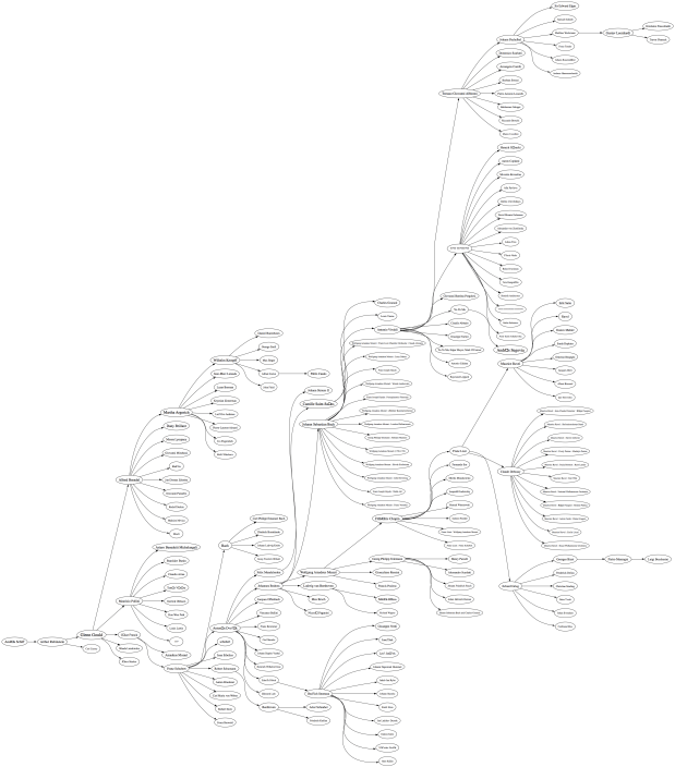
And here’s one showing the near neighbors to Johann Sebastian Bach:
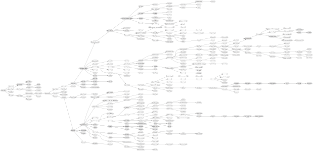
This graphing technique works pretty well, so lets try an larger set of artists. Here I’m plotting the top 2,000 most popular artists. Now, unlike the Beatles neighborhood, this set of artists is not guaranteed to be connected, so we may have some disjoint cluster in the plot. That is expected and reasonable. The image of the resulting plot is rather large (about 16MB) so here’s a small detail, click on the image to see the whole thing. I’ve also created a PDF version which may be easier to browse through.
I pretty pleased with how these graphs have turned out. We’ve taken a very complex space and created a visualization that shows some of the higher level structure of the space (jazz artists are far away from the thrash artists) as well as some of the finer details – the female bubblegum pop artists are all near each other. The technique should scale up to even larger sets of artists. Memory and compute time become the limiting factors, not graph complexity. Still, the graphs aren’t perfect – seemingly inconsequential artists sometimes appear as gateways into whole sub genre. A bit more work is needed to figure out a better ordering for nodes in the graph.
Some things I’d like to try, when I have a bit of spare time:
- Create graphs with 20K artists (needs lots of memory and CPU)
- Try to use top terms or tags of nearby artists to give labels to clusters of artists – so we can find the Baroque composers or the hair metal bands
- Color the nodes in a meaningful way
- Create dynamic versions of the graph to use them for music exploration. For instance, when you click on an artist you should be able to hear the artist and read what people are saying about them.
To create these graphs I used some pretty nifty tools:
- The Echo Nest developer web services – I used these to get the artist similarity, familiarity and hotness data. The artist similarity data that you get from the Echo Nest is really nice. Since it doesn’t rely directly on collaborative filtering approaches it avoids the problems I’ve seen with data from other sources of artist similarity. In particular, the Echo Nest similarity data is not plagued by hubs (for some music services, a popular band like Coldplay may have hundreds or thousands of near neighbors due to a popularity bias inherent in CF style recommendation). Note that I work at the Echo Nest. But don’t be fooled into thinking I like the Echo Nest artist similarity data because I work there. It really is the other way around. I decided to go and work at the Echo Nest because I like their data so much.
- Graphviz – a tool for rendering graphs
- Jung – a Java library for manipulating graphs
If you have any ideas about graphing artists – or if you’d like to see a neighborhood of a particular artist. Please let me know.
Artist similarity, familiarity and hotness
Posted by Paul in Music, recommendation, The Echo Nest, visualization, web services on May 25, 2009
 The Echo Nest developer web services offer a number of interesting pieces of data about an artist, including similar artists, artist familiarity and artist hotness. Familiarity is an indication of how well known the artist is, while hotness (which we spell as the zoolanderish ‘hotttnesss’) is an indication of how much buzz the artist is getting right now. Top familiar artists are band like Led Zeppelin, Coldplay, and The Beatles, while top ‘hottt’ artists are artists like Katy Perry, The Boy Least Likely to, and Mastodon.
I was interested in understanding how familiarity, hotness and similarity interact with each other, so I spent my Memorial day morning creating a couple of plots to help me explore this. First, I was interested in learning how the familiarity of an artist relates to the familiarity of that artists’s similar artists. When you get the similar artists for an artist, is there any relationship between the familiarity of these similar artists and the seed artist? Since ‘similar artists’ are often used for music discovery, it seems to me that on average, the similar artists should be less familiar than the seed artist. If you like the very familiar Beatles, I may recommend that you listen to ‘Bon Iver’, but if you like the less familiar ‘Bon Iver’ I wouldn’t recommend ‘The Beatles’. I assume that you already know about them. To look at this, I plotted the average familiarity for the top 15 most similar artists for each artist along with the seed artist’s familiarity. Here’s the plot:
 In this plot, I’ve take the top 18,000 most familiar artists, ordered them by familiarity. The red line is the familiarity of the seed artist, and the green cloud shows the average familiarity of the similar artists. In the plot we can see that there’s a correlation between artist familiarity and the average familiarity of similar artists. We can also see that similar artists tend to be less familiar than the seed artist. This is exactly the behavior I was hoping to see. Our similar artist function yields similar artists that, in general, have an average famililarity that is less than the seed artist.
This plot can help us q/a our artist similarity function. If we see the average familiarity for similar artists deviates from the standard curve, there may be a problem with that particular artist. For instance, T-Pain has a familiarity of 0.869, while the average familiarity of T-Pain’s similar artists is 0.340. This is quite a bit lower than we’d expect – so there may be something wrong with our data for T-Pain. We can look at the similars for T-Pain and fix the problem.
For hotness, the desired behavior is less clear. If a listener starting from a medium hot artist is looking for new music, it is unclear whether or not they’d like a hotter or colder artist. To see what we actually do, I looked at how the average hotness for similar artists compare to the hotness of the seed artist. Here’s the plot:
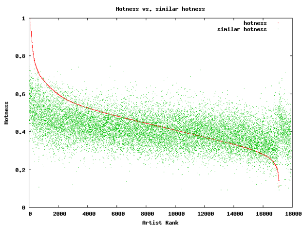 In this plot, the red curve is showing the hotness of the top 18,000 most familiar artists. It is interesting to see the shape of the curve, there are very few ultra-hot artists (artists with a hotness about .8) and very few familiar, ice cold artists (with a hotness of less than 0.2). The average hotness of the similar artists seems to be somewhat correlated with the hotness of the seed artist. But markedly less than with the familiarity curve. For hotness if your seed artist is hot, you are likely to get less hot similar artists, while if the seed artist is not hot, you are likely to get hotter artists. That seems like reasonable behavior to me.
Well, there you have it. Some Monday morning explorations of familiarity, similarity and hotness. Why should you care? If you are building a music recommender, familiarity and hotness are really interesting pieces of data to have access to. There’s a subtle game a recommender has to play, it has to give a certain amount of familiar recommendations to gain trust, while also giving a certain number of novel recommendations in order to enable music discovery.
The BPM Explorer
Posted by Paul in code, fun, java, processing, startup, tags, The Echo Nest, Uncategorized, visualization, web services on April 9, 2009
Last month I wrote about using the Echo Nest API to analyze tracks to generate plots that you can use to determine whether or not a machine is responsible for setting the beat of a song. I received many requests to analyze tracks by particular artists, far too many for me to do without giving up my day job. To satisfy this pent up demand for click track analysis I’ve written an application called the BPM Explorer that you let you create your own click plots. With this application you can analyze any song in your collection, view its click plot and listen to your music, synchronized with the plot. Here’s what the app looks like:
Check out the application here: The Echo Nest BPM Explorer. It’s written in Processing and deployed with Java Webstart, so it (should) just work.
My primary motiviation for writing this application was to check out the new Echo Nest Java Client to make sure that it was easy to use from Processing. One of my secret plans is to get people in the Processing community interested in using the Echo Nest API. The Processing community is filled with some ultra-creative folks that have have strong artistic, programming and data visualization skills. I’d love to see more song visualizations like this and this that are built using the Echo Nest APIs. Processing is really cool – I was able to write the BPM explorer in just a few hours (it took me longer to remember how to sign jar files for webstart than it did to write the core plotter). Processing strips away all of the boring parts of writing graphic programming (create a frame, lay it out with a gridbag, make it visible, validate, invalidate, repaint, paint arghh!). For processing, you just write a method ‘draw()’ that will be called 30 times a second. I hope I get the chance to write more Processing programs.
Update: I’ve released the BPM Explorer code as open source – as part of the echo-nest-demos project hosted at google-code. You can also browse the read for the BPM Explorer.
Using Visualizations for Music Discovery
Posted by Paul in music information retrieval, research, tags, visualization on March 28, 2009
As Ben pointed out last week, the ISMIR site has posted the tutorial schedule for ISMIR 2009. I’m happy to see that the tutorial that Justin Donaldson and I proposed was accepted. Our tutorial is called Using Visualizations for Music Discovery. Here’s the abstract:
As the world of online music grows, tools for helping people find new and interesting music in these extremely large collections become increasingly important. In this tutorial we look at one such tool that can be used to help people explore large music collections: data visualization. We survey the state-of-the-art in visualization for music discovery in commercial and research systems. Using numerous examples, we explore different algorithms and techniques that can be used to visualize large and complex music spaces, focusing on the advantages and the disadvantages of the various techniques. We investigate user factors that affect the usefulness of a visualization and we suggest possible areas of exploration for future research.
I’m excited about this tutorial – mainly because I get to work with Justin on it. He’s a really smart guy who really knows the state-of-the-art in visualizations. I’ll just be tagging along for the ride.
We are in the survey phase of talk preparation now. We’ve been gathing info on various types of visualizations and tagging them with the delicious tag MusicVizIsmir2009. Feel free to tag along (pun intended) with us and tag items that you encounter that you feel may be particularly interesting, unique or salient.
The Loudness War Analyzed
Posted by Paul in code, data, fun, Music, research, The Echo Nest, visualization on March 23, 2009
Recorded music doesn’t sound as good as it used to. Recordings sound muddy, clipped and lack punch. This is due to the ‘loudness war’ that has been taking place in recording studios. To make a track stand out from the rest of the pack, recording engineers have been turning up the volume on recorded music. Louder tracks grab the listener’s attention, and in this crowded music market, attention is important. And thus the loudness war – engineers must turn up the volume on their tracks lest the track sound wimpy when compared to all of the other loud tracks. However, there’s a downside to all this volume. Our music is compressed. The louds are louds and the softs are loud, with little difference. The result is that our music seems strained, there is little emotional range, and listening to loud all the time becomes tedious and tiring.
I’m interested in looking at the loudness for the recordings of a number of artists to see how wide-spread this loudness war really is. To do this I used the Echo Nest remix API and a bit of Python to collect and plot loudness for a set of recordings. I did two experiments. First I looked at the loudness for music by some of my favorite or well known artists. Then I looked at loudness over a large collection of music.
First, lets start with a loudness plot of Dave Brubeck’s Take Five. There’s a loudness range of -33 to about -15 dBs – a range of about 18 dBs.
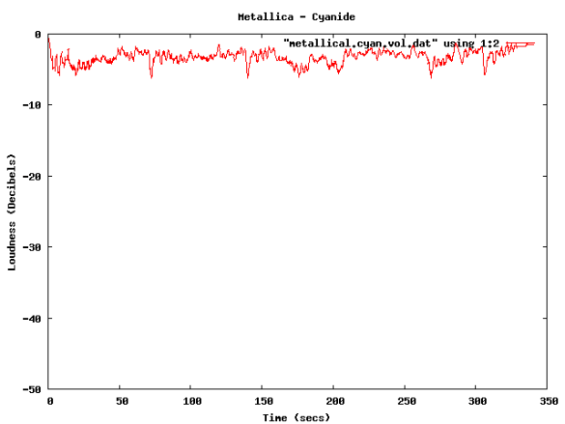
Now take a look at a track from the new Metallica album. Here we see a dB range of from about -3 dB to about -6 dB – for a range of about 3 dB. The difference is rather striking. You can see the lack of dynamic range in the plot quite easily.
Now you can’t really compare Dave Brubeck’s cool jazz with Metallica’s heavy metal – they are two very different kinds of music – so lets look at some others. (One caveat for all of these experiments – I don’t always know the provenance of all of my mp3s – some may be from remasters where the audio engineers may have adjusted the loudness, while some may be the original mix).
Here’s the venerable Stairway to Heaven – with a dB range of -40 dB to about -5dB for a range of 35 dB. That’s a whole lot of range.
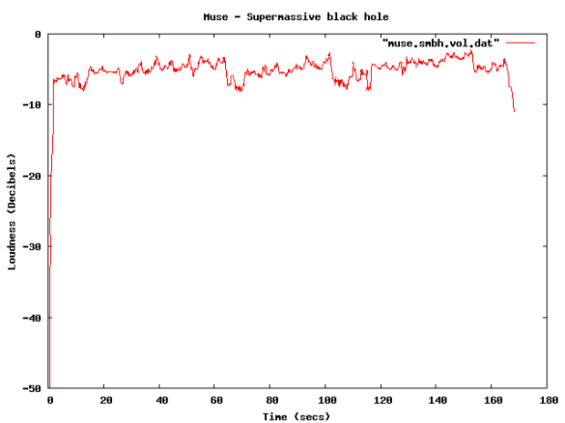
Compare that to the track ‘supermassive black hole’ – by Muse – with a range of just 4dB. I like Muse, but I find their tracks to get boring quickly – perhaps this is because of the lack of dynamic range robs some of the emotional impact. There’s no emotional arc like you can see in a song like Stairway to Heaven.
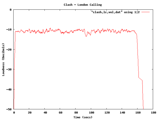
Some more examples – The Clash – London Calling. Not a wide dynamic range – but still not at ear splitting volumes.
This track by Nickleback is pushing the loudness envelope, but does have a bit of dynamic range.
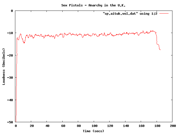
Compare the loudness level to the Sex Pistols. Less volume, and less dynamic range – but that’s how punk is – all one volume.
The Stooges – Raw Power is considered to be one of the loudest albums of all time. Indeed, the loudness curve is bursting through the margins of the plot.
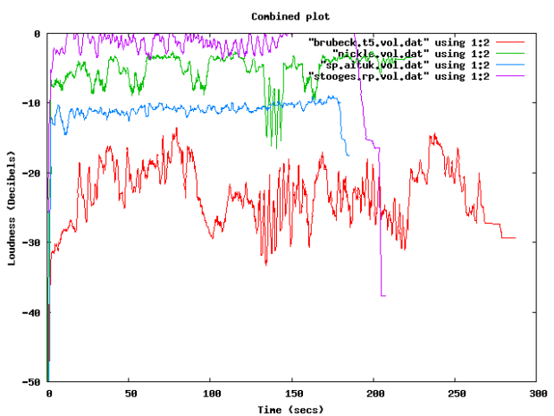
Here in one plot are 4 tracks overlayed – Red is Dave Brubeck, Blue is the Sex Pistols, Green is Nickleback and purple is the Stooges.
There been quite a bit of writing about the loudness war. The wikipedia entry is quite comprehensive, with some excellent plots showing how some recordings have had a loudness makeover when remastered. The Rolling Stone’s article: The Death of High Fidelity gives reactions of musicians and record producers to the loudness war. Producer Butch Vig says “Compression is a necessary evil. The artists I know want to sound competitive. You don’t want your track to sound quieter or wimpier by comparison. We’ve raised the bar and you can’t really step back.”
The loudest artists
I have analyzed the loudness of about 15K tracks from the top 1,000 or so most popular artists. The average loudness across all 15K tracks is about -9.5 dB. The very loudest artists from this set – those with a loudness of -5 dB or greater are:
| Artist | dB |
|---|---|
| Venetian Snares | -1.25 |
| Soulja Boy | -2.38 |
| Slipknot | -2.65 |
| Dimmu Borgir | -2.73 |
| Andrew W.K. | -3.15 |
| Queens of the Stone Age | -3.23 |
| Black Kids | -3.45 |
| Dropkick Murphys | -3.50 |
| All That Remains | -3.56 |
| Disturbed | -3.64 |
| Rise Against | -3.73 |
| Kid Rock | -3.86 |
| Amon Amarth | -3.88 |
| The Offspring | -3.89 |
| Avril Lavigne | -3.93 |
| MGMT | -3.94 |
| Fall Out Boy | -3.97 |
| Dragonforce | -4.02 |
| 30 Seconds To Mars | -4.08 |
| Billy Talent | -4.13 |
| Bad Religion | -4.13 |
| Metallica | -4.14 |
| Avenged Sevenfold | -4.23 |
| The Killers | -4.27 |
| Nightwish | -4.37 |
| Arctic Monkeys | -4.40 |
| Chromeo | -4.42 |
| Green Day | -4.43 |
| Oasis | -4.45 |
| The Strokes | -4.49 |
| System of a Down | -4.51 |
| Blink 182 | -4.52 |
| Bloc Party | -4.53 |
| Katy Perry | -4.76 |
| Barenaked Ladies | -4.76 |
| Breaking Benjamin | -4.80 |
| My Chemical Romance | -4.81 |
| 2Pac | -4.94 |
| Megadeth | -4.97 |
It is interesting to see that Avril Lavigne is louder than Metallica and Katy Perry is louder than Megadeth.
The Quietest Artists
Here are the quietest artists:
| Artist | dB |
|---|---|
| Brian Eno | -17.52 |
| Leonard Cohen | -16.24 |
| Norah Jones | -15.75 |
| Tori Amos | -15.23 |
| Jeff Buckley | -15.21 |
| Neil Young | -14.51 |
| Damien Rice | -14.33 |
| Lou Reed | -14.33 |
| Cat Stevens | -14.22 |
| Bon Iver | -14.14 |
| Enya | -14.13 |
| The Velvet Underground | -14.05 |
| Simon & Garfunkel | -14.03 |
| Pink Floyd | -13.96 |
| Ben Harper | -13.94 |
| Aphex Twin | -13.93 |
| Grateful Dead | -13.85 |
| James Taylor | -13.81 |
| The Very Hush Hush | -13.73 |
| Phish | -13.71 |
| The National | -13.57 |
| Paul Simon | -13.53 |
| Sufjan Stevens | -13.41 |
| Tom Waits | -13.33 |
| Elvis Presley | -13.21 |
| Elliott Smith | -13.06 |
| Celine Dion | -12.97 |
| John Lennon | -12.92 |
| Bright Eyes | -12.92 |
| The Smashing Pumpkins | -12.83 |
| Fleetwood Mac | -12.82 |
| Tool | -12.62 |
| Frank Sinatra | -12.59 |
| A Tribe Called Quest | -12.52 |
| Phil Collins | -12.27 |
| 10,000 Maniacs | -12.04 |
| The Police | -12.02 |
| Bob Dylan | -12.00 |
(note that I’m not including classical artists that tend to dominate the quiet side of the spectrum)
Again, there are caveats with this analysis. Many of the recordings analyzed may be remastered versions that have have had their loudness changed from the original. A proper analysis would be to repeat using recordings where the provenance is well known. There’s an excellent graphic in the wikipedia that shows the effect that remastering has had on 4 releases of a Beatles track.
Loudness as a function of Year
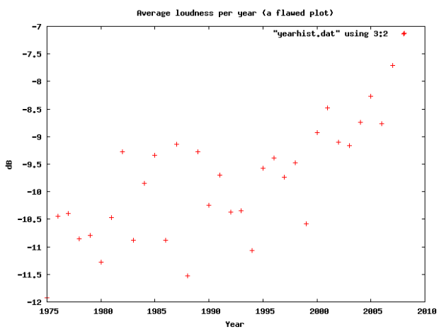
Here’s a plot of the loudness as a function of the year of release of a recording (the provenance caveat applies here too). This shows how loudness has increased over the last 40 years
I suspect that re-releases and re-masterings are affecting the Loudness averages for years before 1995. Another experiment is needed to sort that all out.
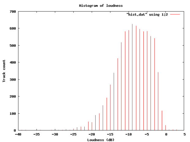
Loudness Histogram:
This table shows the histogram of Loudness:
Average Loudness per genre
This table shows the average loudness as a function of genre. No surprise here, Hip Hop and Rock is loud, while Children’s and Classical is soft:
| Genre | dB |
|---|---|
| Hip Hop | -8.38 |
| Rock | -8.50 |
| Latin | -9.08 |
| Electronic | -9.33 |
| Pop | -9.60 |
| Reggae | -9.64 |
| Funk / Soul | -9.83 |
| Blues | -9.86 |
| Jazz | -11.20 |
| Folk, World, & Country | -11.32 |
| Stage & Screen | -14.29 |
| Classical | -16.63 |
| Children’s | -17.03 |
So, why do we care? Why shouldn’t our music be at maximum loudness? This Youtube video makes it clear:
 Luckily, there are enough people that care about this to affect some change. The organization Turn Me Up! is devoted to bringing dynamic range back to music. Turn Me Up! is a non-profit music industry organization working together with a group of highly respected artists and recording professionals to give artists back the choice to release more dynamic records.
If I had a choice between a loud album and a dynamic one, I’d certainly go for the dynamic one.
Update: Andy exhorts me to make code samples available – which, of course, is a no-brainer – so here ya go: volume.py
Song Visualizations
Posted by Paul in Music, visualization on March 19, 2009
A couple of people sent me this link today: Song Visualizations with Echo Nest.These are song plots made using the Echo Nest Analyze API. They are quite aesthically pleasing. As the creator, Chris Mueller points out, the plots are similar to those that Anita created with the music box. In addition to the pitch plot, Chris includes a plot of the volume change over the course of the song. (It might be nice to low-pass filter the volume to make it smoother). These are very nice song visualizations. Well done.
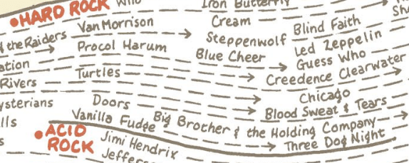
After you check out the Song Visualizations, be sure to check out the rest of the blog. Chris has some great posts about subway maps (little known fact, I have a London Tube map with music artists superimposed on all the stations hanging in my kitchen).
(shhh, don’t tell anyone, but a secret spare time project of mine is to recreate this map properly, so that the artist relations reflect reality, and the artist popularity is proportional to a stations popularity … I have all of the artist relation data (thanks to the Echo Nest), I just need the tube connectivity graph and station data).


