Posts Tagged click track
Revisiting the click track
Posted by Paul in Music, The Echo Nest on February 8, 2010
One of my more popular posts from last year was ‘In Search of the Click track‘ where I posted some plots showing the tempo deviations from the average tempo for a number of songs. From these plots it was pretty easy to see which songs had a human setting the beat and which songs had a machine setting the beat (be it a click track, drum machine or an engineer fitting the song to a tempo grid). I got lots of feedback along with many requests to generate click plots for particular drummers. It was a bit of work to generate a click plot (find the audio, upload it to the analyzer, get the results, normalize the data, generate the plot, convert it to an image and finally post it to the web) so I didn’t create too many more.
Last week Brian released the alpha version of a nifty new set of APIs that give access to the analysis data for millions of tracks. Over the weekend, I wrote a web application that takes advantage of the new APIs to make it easy to get a click plot for just about any track. Just type in the name of the artist and track and you’ll get the click plot – you don’t have to find the audio or upload it or wrestle with python or gnuplot. The web app is here:
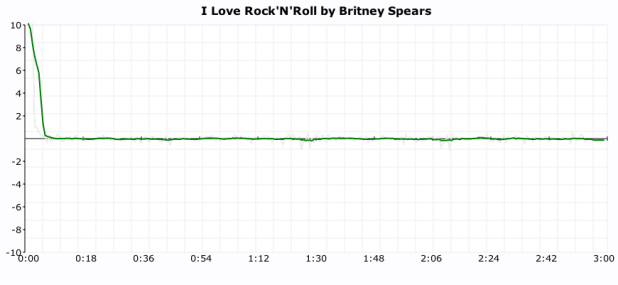
Here are some examples of the output. First up is a plot of “I love rock’n’ roll’ by Britney Spears. The plot shows the tempo deviations from the average song tempo over the course of the song. The plot shows that there’s virtually no deviation at all. Britney is using a machine to set the beat.
Now compare Britney’s plot to the click plot for the song ‘So Lonely’ by the Police:
 Here we see lots of tempo variation. There are four main humps each corresponding to each chorus where Police drummer Stewart Copeland accelerates the beat. Over the course of the song there is an increase in the average tempo that build tension and excitement. In this song the tempo is maintained by a thinking, feeling human, whereas Britney is using a coldhearted, sterile machine to set the tempo for her song.
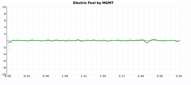
For some types of music, machine generated tempos are appropriate. Electronica, synthpop and techno benefit from an ultra-precise tempo. Some examples are Kraftwerk and The Postal Service:

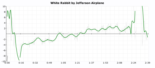
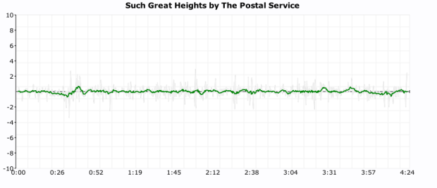 But for many songs, the tempo variations add much to the song. The gradual speed up in Jefferson Airplane’s White Rabbit:
and the crescendo in ‘In the Hall of the Mountain King’:
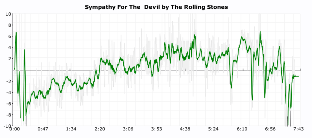
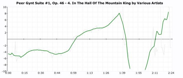 And in the Rolling Stone’s Sympathy for the Devil
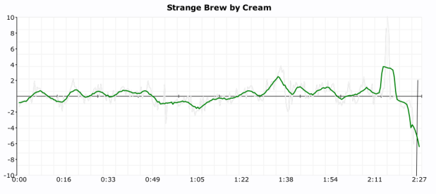
It is also fun to use the click plots to see how steady drummers are (and to see which ones use clicktracks). Some of my discoveries:
Keith Moon used a click track on ‘Won’t Get Fooled Again’:
 (You can see him wearing headphones in this video)
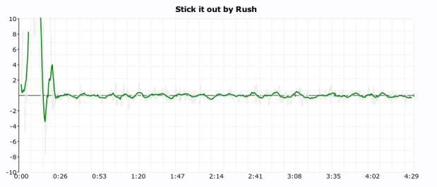
It looks like Neil Peart uses a click track on Stick it out:
Art Blakey can really lay it down without a click track (he really looks like a machine here):
 As does Ginger Baker (or does he use a click?):
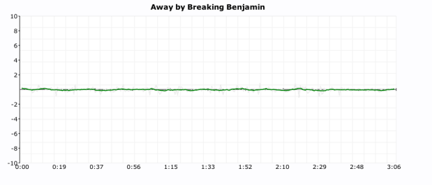
It seems that all of the nümetal bands use clicks:
Breaking Benjamin
Nickelback
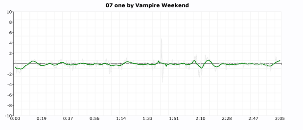
 As do some of the indie bands:
The Decemberists
I find it interesting to look at the various click plots. It gives me a bit more insight into the band and the drummer. However, some types of music such as progressive rock – with its frequent time signature and tempo changes are really hard to plot – which is too bad since many of the best drummers play prog rock.
In addition the plots I attempted a couple of objective metrics that can be used to measure the machine like quality of drummer. The Machine Score is a measure of how often the beat is within a 2 BPM window of the average tempo of the song. Higher numbers indicate that the drummer is more like a machine. This metric is a bit troublesome for songs that change tempo, a song that changes tempo often may have a lower machine score than it should. The Longest run of machine like drumming is the count of the longest stretch of continuous beats that are within 1BPM of the average tempo of the song. Long runs (over a couple hundred beats) tend to indicate that a machine is in charge of the beat. Both these metrics are somewhat helpful in determining whether or not the drumming is live, but I still find that the best determinate is to look at the plot. More work is needed here.
The new click plotter was a fun weekend project. I got to use rgraph – an HTML5 canvas graph library (thanks to Ryan for suggesting client-side plotting), along with cherrypy, pound and, of course, the Brian’s new web services. The whole thing is just 500 lines of code.
I hope you enjoy generating your own click plots. If you find some interesting ones post a link here and I’ll add them to the Gallery of Drummers.
Making better plots
Posted by Paul in code, fun, The Echo Nest, visualization on August 5, 2009
For many years, I’ve used awk and gnuplot to generate plots but as I switch over to using Python for my day to day programming, I thought there might be a more Pythonic way to do plots. Google pointed me to Matplotlib and after kicking the tires, I’ve decided to retire gnuplot from my programming toolkit and replace it with matplotlib.
Matplotlib is a 2D plotting library that produces a wide variety of high quality figures suitable for interactive applications or for inserting into publications. A quick tour of the gallery shows the wide range of plots that are possible with Matplotlib. The syntax for creating plots is simple and familiar to anyone who’s used matlab for plotting.
With this new tool in my programming pocket, I thought I’d update my click plotter program to use matplotlib. (The click plotter is a program that generates plots showing how a drummer’s BPM varies over the course of a song. By looking at the generated plots it is easy to see if the beat for a song is being generated by a man or a machine. Read more about it in ‘In Search of the Click Track‘).
The matplotlib code to generate the plots is straightforward:
def plot_click_track(filename): track = track_api.Track(filename) tempo = float(track.tempo['value']) beats = track.beats times = [ dict['start'] for dict in beats ] bpms = get_bpms(times)plt.title('Click Plot for ' + os.path.basename(filename)) plt.ylabel('Beats Per Minute') plt.xlabel('Time') plt.plot(times, get_filtered_bpms(bpms), label='Filtered') plt.plot(times, bpms, color=('0.8'), label='raw') plt.ylim(tempo * .9, tempo * 1.1) plt.axhline(tempo, color=('0.7'), label="Tempo") plt.show()The complete source code for click_plot is in the example directory of the pyechonest module.
Here are a few examples plots generated by click_plot:
To create your own click plots grab the example from the SVN repository, make sure you have pyechonest and matplotlib installed, get an Echo Nest API key and start generating click plots with the command:
% click_plot.py /path/to/music.mp3
The BPM Explorer
Posted by Paul in code, fun, java, processing, startup, tags, The Echo Nest, Uncategorized, visualization, web services on April 9, 2009
Last month I wrote about using the Echo Nest API to analyze tracks to generate plots that you can use to determine whether or not a machine is responsible for setting the beat of a song. I received many requests to analyze tracks by particular artists, far too many for me to do without giving up my day job. To satisfy this pent up demand for click track analysis I’ve written an application called the BPM Explorer that you let you create your own click plots. With this application you can analyze any song in your collection, view its click plot and listen to your music, synchronized with the plot. Here’s what the app looks like:
Check out the application here: The Echo Nest BPM Explorer. It’s written in Processing and deployed with Java Webstart, so it (should) just work.
My primary motiviation for writing this application was to check out the new Echo Nest Java Client to make sure that it was easy to use from Processing. One of my secret plans is to get people in the Processing community interested in using the Echo Nest API. The Processing community is filled with some ultra-creative folks that have have strong artistic, programming and data visualization skills. I’d love to see more song visualizations like this and this that are built using the Echo Nest APIs. Processing is really cool – I was able to write the BPM explorer in just a few hours (it took me longer to remember how to sign jar files for webstart than it did to write the core plotter). Processing strips away all of the boring parts of writing graphic programming (create a frame, lay it out with a gridbag, make it visible, validate, invalidate, repaint, paint arghh!). For processing, you just write a method ‘draw()’ that will be called 30 times a second. I hope I get the chance to write more Processing programs.
Update: I’ve released the BPM Explorer code as open source – as part of the echo-nest-demos project hosted at google-code. You can also browse the read for the BPM Explorer.
