Archive for category visualization
Dogstep
Posted by Paul in code, data, fun, hacking, music hack day, The Echo Nest, visualization on November 4, 2013
For my Malmö Music Hack Day hack I built an app called Dogstep. Dogstep takes any song and re-renders it such that a pack of dogs harmonizes along with the song. It was a lot of fun to build and I was rather pleased with the results. You can try the app out yourself: Dogstep.
I got to try a few new things on this hack. First, off I needed some good dog sounds. I found all I needed and more at Freesound.org. What a great resource that is! I then needed to process the barks (trim them, pitch shift them, volume-equalize ). For this I used Audacity. It was way easier to use than garageband and it has all the audio filters that I needed (including the awesome Paul’s stretch we can make any howl sound like a banshee from hell).
To create realistic and varying barking, I created a barking state machine, where each state in the machine represents the barking activity for a bar in the song and each state has a set of transitions to other states in the machine governed by a probability that that transition will be taken. When a song is playing, I use the state machine to pick the state for the currently playing bar and emit the barking audio at the right times within the bar. Here’s a visualization of the barking state machine:
In addition to these barks, I look for the loudest parts in the songs and add a bunch of extra howling at these peak moments. Finally, I use the Stylophone play-along algorithm to have one of the dogs try to sing along with the melody.
Creating this state machine was really fun. There’s still a few bits that I want to do – such as having separate state machines for different parts of the song – i.e. a state machine when the song is very quiet vs. one when the song is loud and energetic. A hack is never really done.
The source for the hack is on github.
Visualizing the Structure of Pop Music
Posted by Paul in code, data, ismir, Music, music information retrieval, The Echo Nest, visualization on November 19, 2012
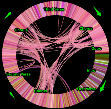
The Infinite Jukebox generates plots of songs in which the most similar beats are connected by arcs. I call these plots cantograms. For instance, below is a labeled cantogram for the song Rolling in the Deep by Adele. The song starts at 3:00 on the circle and proceeds clockwise, beat by beat completely around the circle. I’ve labeled the plot so you can see how it aligns with the music. There’s an intro, a first verse, a chorus, a second verse, etc. until the outro and the end of the song.
One thing that’s interesting is that most of the beat similarity connections occur between the beats in the three instances of the chorus. This certainly makes intuitive sense. The verses have different lyrics, so for the most part they won’t be too similar to each other, but the choruses have the same lyrics, the same harmony, the same instrumentation. They may even be, for all we know may even be exactly the same audio, that perfect performance, cut and pasted three times by the audio engineer to make the best sounding version of the song.
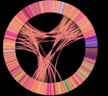
Now take a look at the cantogram for another popular song. The plot below shows the beat similarities for the song Tik Tok by Ke$ha. What strikes me the most about this plot is how similar it looks to the plot for Rolling in the Deep. It has the characteristic longer intro+first verse, some minor inter-verse similarities and the very strong similarities between the three choruses.
As we look at more plots for modern pop music we see the same pattern over and over again. In this plot for Lady Gag’s Paparazzi a cantogram we again see the same pattern.
We see it in the plot for Justin Bieber’s Baby:
Taylor Swift’s Fearless has a two verses before the first chorus, shifting it further around the circle, but other than that the pattern holds:
Now compare and contrast the pop cantograms with those from other styles of music. First up is Led Zeppelin’s Stairway to heaven. There’s no discernable repeating chorus, or global song repetition, the only real long-arc repetition occurs during the guitar solo for the last quarter of the song.
Here’s another style of music. Deadmau5’s Raise your weapon. This is electronica (and maybe some dubstep). Clearly from the cantogram we can see that is is not a traditional pop song. Very little long arc repetition, with the densest cluster being the final dubstep break.
Dave Brubeck’s Take Five has a very different pattern, with lots of short term repetition during the first half of the song, while during the second half with Joe Morello’s drum solo there’s a very different pattern.
Green Grass and High Tides has yet a different pattern – no three choruses and out here. (By the way, the final guitar solo is well worth listening to in the Infinite Jukebox. It is the guitar solo that never ends).
The progressive rock anthem Roundabout doesn’t have the Pop Pattern
Nor does Yo-Yo Ma’s performance of the Cello suite No. 1.
Looking at the pop plots one begins to understand that pop music really could be made in a factory. Each song is cut from the same mold. In fact, one of the most successful pop songs in recent years, was produced by a label with factory in its name. Looking at Rebecca Black’s Friday we can tell right away that it is a pop song:
Compare that plot to this years Youtube breakout, Thanksgiving by Nicole Westbrook, (another Ark Music Factory assembly):
The plot has all the makings of the standard pop song for the 2010s.
In the music information retrieval research community there has been quite a bit of research into algorithmically extracting song structure, and visualizations are often part of this work. If you are interested in learning more about this research, I suggest looking at some of the publications by Meinard Müller and Craig Sapp.
Of course, not every pop song will follow the pattern that I’ve shown here. Nevertheless, I find it interesting that this very simple visualization is able to show us something about the structure of the modern pop song, and how similar this structure is across many of the top pop songs.
update: since publishing this post I’ve updated the layout algorithm in the Infinite Jukebox so that songs start and end at 12 Noon and not 3PM, so the plots you see in this post are rotated 90degrees clockwise from what you would see in the jukebox.
Map of Music Styles
Posted by Paul in code, data, events, fun, tags, The Echo Nest, visualization on April 22, 2012
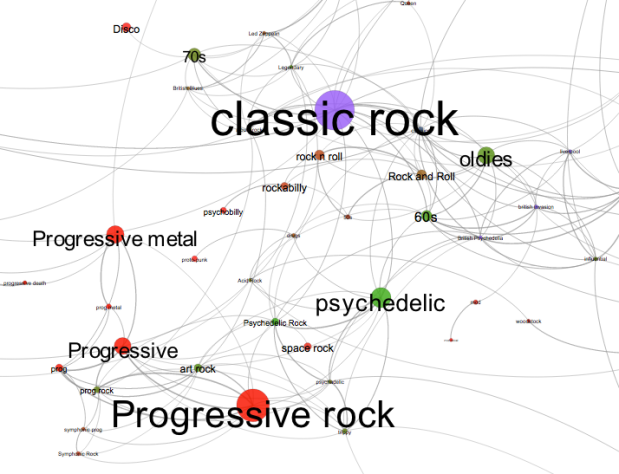
I spent this weekend at Rethink Music Hackers’ Weekend building a music hack called Map of Music Styles (aka MOMS). This hack presents a visualization of over 1000 music styles. You can pan and zoom through the music space just like you can with Google maps. When you see an interesting style of music you can click on it to hear some samples of music of that style.
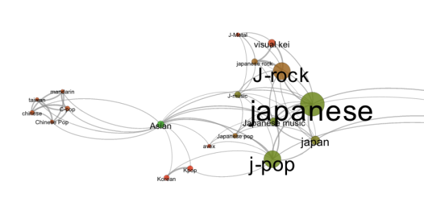
It is fun to explore all the different neighborhoods of music styles. Here’s the Asian corner:
Here’s the Hip-Hop neighborhood:
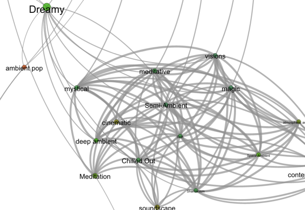
And a mega-cluster of ambient/chill-out music:
To build the app, I collected the top 2,000 or so terms via The Echo Nest API. For each term I calculated the most similar terms based upon artist overlap (for instance, the term ‘metal’ and ‘heavy metal’ are often applied to the same artists and so can be considered similar, where as ‘metal’ and ‘new age’ are rarely applied to the same artist and are, therefore, not similar). To layout the graph I used Gephi (Its like Photoshop for graphs) and exported the graph to SVG. After that it was just a bit of Javascript, HTML, and CSS to create the web page that will let you pan and zoom. When you click on a term, I fetch audio that matches the style via the Echo Nest and 7Digital APIs.
There are a few non-styles that snuck through – the occasional band name, or mood, but they don’t hurt anything so I let them hang out with the real styles. The app works best in Chrome. There’s a bug in the Firefox version that I need to work out.
Give it a try and let me know how you like it: Map of Music Styles
Visualizing the active years of popular artists
Posted by Paul in data, Music, The Echo Nest, visualization on June 21, 2011
This week the Echo Nest is extending the data returned for an artist to include the active years for an artist. For thousands of artists you will be able to retrieve the starting and ending date for an artists career. This may include multiple ranges as groups split and get back together for that last reunion tour. Over the weekend, I spent a few hours playing with the data and built a web-based visualization that shows you the active years for the top 1000 or so hotttest artists.
The visualization shows the artists in order of their starting year. You can see the relatively short careers of artists like Robert Johnson and Sam Cooke, and the extremely long careers of artists like The Blind Boys of Alabama and Ennio Morricone. The color of an artist’s range bar is proportional to the artist’s hotttnesss. The hotter the artist, the redder the bar. Thanks to 7Digital, you can listen to a sample of the artist by clicking on the artist. To create the visualization I used Mike Bostock’s awesome D3.js (Data Driven Documents) library.
It is fun to look at some years active stats for the top 1000 hotttest artists:
- Average artist career length: 17 years
- Percentage of top artists that are still active: 92%
- Longest artist career: The Blind Boys of Alabama – 73 Years and still going
- Gone but not forgotten – Robert Johnson – Hasn’t recorded since 1938 but still in the top 1,000
- Shortest Career – Joy Division – Less than 4 Years of Joy
- Longest Hiatus – The Cars – 22 years – split in 1988, but gave us just what we needed when they got back together in 2010
- Can’t live with’em, can’t live without ’em – Simon and Garfunkel – paired up 9 separate times
- Newest artist in the top 1000 – Birdy – First single released in March 2011
Check out the visualization here: Active years for the top 1000 hotttest artists and read more about the years-active support on the Echo Nest blog
Masters of Media » Music visualizations as a means for discovery
Posted by Paul in Music, visualization on April 15, 2011
Nifty blog post by Megan Adams about using music visualization as a means for discovery:
Masters of Media » Music visualizations as a means for discovery.
Megan points to this thread on Tufte’s BBS about Reebee Garofalo’s ‘Genealogy of Pop/Rock Music”:
The comments in the BBS thread point to a number of visualizations that I hadn’t seen before including: this book on Rock Family Trees along with this incredibly detailed view of the Liverpool music scene.
Finding Music With Pictures – The Video
Posted by Paul in events, Music, visualization on March 28, 2011
I gave a panel at SXSWi this year on using data visualization for music discovery. Mike Hochanadel made a video of the talk and has posted it online.
Be sure to check out the rest of Mike’s blog hoketronics – he has solid coverage on many of the SXSWi panels.
Finding music with pictures: Data visualization for discovery
Posted by Paul in data, Music, visualization on March 13, 2011
I just finished giving my talk at SXSW called – ‘Finding Music with Pictures”. A few people asked for the slides – I’ve posted them to Slideshare. Of course all the audio and video is gone, but you can follow the links to see the vids. Here are the slides:
Lots of good tweets from the audience. And Hugh Garry has Storify’d the talk.
The SXSW Music Maze
Posted by Paul in code, fun, visualization on March 10, 2011
There are thousands of artists playing at SXSW this year. To help sort it all out, I thought I’d adapt my Music Maze to work within the world of SXSW 2011 artists. It is a good way to figure out which bands you’d like to see.
This visualization fits in with the SXSW talk I’m giving in a few days: Finding Music With Pictures
What’s your favorite music visualization for discovery?
Posted by Paul in Music, visualization on February 28, 2011
In a couple of weeks I’m giving a talk at SXSW called Finding Music with pictures : Data visualization for discovery. In this panel I’ll talk about how visualizations can be used to help people explore the music space and discover new, interesting music that they will like. I intend to include lots of examples both from the commercial world as well as from the research world.
I’ll be drawing material from many sources including the Tutorial that Justin and I gave at ISMIR in Japan in October 2009: Using visualizations for music discovery. Of course lots of things have happened in the year and a half since we put together that tutorial such as iPads, HTML5, plus tons more data availability. If you happen to have a favorite visualization for music discovery, post a link in the comments or send me an email: paul [at] echonest.com.
The 3D Music Explorer
Posted by Paul in events, Music, visualization on January 27, 2011
Next month I’m giving a talk at SXSW Interactive on using visualizations for discovering music. In my talk I’ll be giving a number of demos of various types of visualizations used for music exploration and discovery. One of the demos is an interactive 3D visualizer that I built a few years back. The goal of this visualizer is to allow you to use 3D game mechanics to interact with your music collection. Here’s a video
Hope to see you at the talk.


